You understand the power of representation. If your website looks outdated, isn’t secure, or loads slowly, then what does that say about your legal team? Make sure your website sends the right message with web design services that leverage the best law firm website design trends of 2025.
- 14 Attorney Website Design Fundamentals
- 2I. Mobile-Friendly Design
- 3II. User-Friendly Web Design
- 4III. Valuable Content
- 5IV. Optimized Performance
- 66 Law Firm Website Design Trends
- 7I. Cinemagraphs
- 8II. Legal Fonts
- 9III. Video Content
- 10IV. Micro-Animations
- 11V. Minimalist Web Design
- 12VI. Chatbots
- 13Conclusion
4 Essential Elements of Attorney Website Design
Before we dig into this year’s law firm web design trends, there are 4 foundational features that every attorney website should have:
- Responsive design
- User-friendly navigation
- High-quality content
- Optimized performance
These features impact the overall user experience (UX) of a website and your search engine optimization. If a user doesn’t immediately and passively process these 3 web design elements, they may leave your website to search for a more navigable, clear-cut competitor:
1. Mobile-Friendly Design
Have you ever tried to view a website on a smartphone, but you can’t see the information in one view? You’re forced to pinch and drag the screen repeatedly, or worse – leave the site to find the information elsewhere. As a business owner, you need to make sure your website is responsive and mobile-friendly so as to not frustrate and potentially lose clients.
Mobile web design ensures that your website is accessible on any device. Mobile website design is also known as responsive design, as it responds to the layout of whatever device it is displayed on. This means your website needs to be custom coded so that it automatically adapts to the screen size and resolution of the device used, regardless of its dimensions.
Research shows that mobile users account for approximately half of web users worldwide. In the second quarter of 2022 mobile devices generated 58.99% of global users.
Your website must be mobile-friendly to appeal to those that access websites and make searches using their smartphones, smartwatches, or tablets. If those stats aren’t enough to convince you to go mobile, Google prefers mobile-friendly websites and prioritizes them in search results. This means that if a competing law firm has a responsive website and you do not, search engine crawlers will display their website above yours in search results pages.
2. User-Friendly Web Design
“User-friendly” means that something is easy to use or understand. A user-friendly website is one that is easy to navigate and use. Whether a visitor is looking for information, to make a purchase, or schedule a consultation, it needs to be accessible and digestible.
It’s not enough to build a beautiful website that creates a positive impression. Ease-of-use and accessibility also apply to those that are visually impaired. This means your attorney website must be ADA-compliant or risk facing legal ramifications.
3. Valuable Content
While it’s important to be unique and position yourself as an expert in your field, you also want the content on your website to connect with the people that need your services. Be clear and concise with your calls to action and make sure that you’re providing value to users no matter where they land on your website.
Your voice and the information you provide should portray authority, clarity, and expertise. Avoid technical jargon and focus on clearly explaining your legal services. Make it clear who you serve, your practice areas, and how users can request case evaluations.
4. Optimized Performance
Your website has two audiences: potential clients and search engines. If your law firm website design is not optimized for search engine crawlers, you might be getting buried in search engine results pages because of your website’s poor performance.
Do a quick audit of your website and ask these questions:
- Does your website load in under 3 seconds?
- Does it have schema markup?
- Is your content keyword-rich & relevant?
- Does all of your meta information follow search engine guidelines?
If you can’t answer those questions, you may need a professional website audit or a website redesign.
6 Law Firm Website Design Trends
Your website needs to reflect your authority and expertise, while properly representing your professionalism and brand. From advanced forms and chatbots to interactive elements and ADA-compliant content, it’s important to leverage the top attorney website design features.
Incorporating these modern design elements into your website can help you showcase your expertise and professionalism. A website that is clean and easy to use will always create an excellent first impression with visitors and encourage them to learn more about your practice.
1. Cinemagraphs
UX (user experience) is more important when designing websites than ever before. Using interactive elements, like cinemagraphs, helps evoke emotion, appreciation, and credibility. Cinemagraphs are images in which micro-animations or micro-interactions occur. A GIF is a commonly used type of cinemagraph.
Cinemagraphs add a subtly interactive element to your website. This latest web design trend uses high-quality images that blend video and photography with subtle motion on a fluid, unbroken loop. Cinemagraphs capture attention and provide a more immersive experience, keeping users engaged and interested in your website.
In the example above, maritime law firm Arnold & Itkin LLP, leverages cinemagraphs to create an “out-at-sea” experience. Their audience, people affected by maritime law or offshore accidents, can relate to the imagery (offshore drilling, oil rigs, sea vessels, etc.) and immediately understand what type of law this law firm practices.
2. Legal Fonts
Choosing the font for legal documents matters. Just like you need to ensure your audience can easily read and process legal documentation, you also want them to understand the information presented on your law firm’s website.
The best font to use for an attorney website design can either be Serif or Sans Serif fonts – it’s a matter of design and branding. While it’s the dealer’s choice when it comes to ultra-modern vs. a touch of flare, you do need to be mindful of professionalism and readability. The best fonts to use for legal websites are those that are clean, professional, and easy to read on any screen.
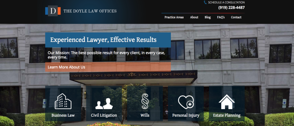
Serif Fonts
The text in the image above shows a Serif font. Serif fonts are those that have handles, or decorative strokes on the edges.
Some of the most popular Serif fonts are:
- Casion
- Garamond
- Freight Text
- Tiempos Text
- Minion
Tip: When using serif font on your website, preview it on a small screen to ensure the typeface is clear, crisp, and easy to read. You may find a blend of serif for headers and subheaders blended with sans-serif font for your main content creates an attractive, modern balance.
Sans Serif Fonts
As you can imagine, Sans Serif fonts are those that do not have the additional touches of design. They are easier to read and ultra modern which makes them a great choice for body text. Sans Serif fonts also portray a clean and professional look in headings, particularly when set at a heavier font weight and size.
Some of the most popular Sans Serif fonts for legal web design:
- Arial
- Futura
- Helvetica
- Montserrat
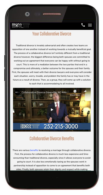
3. Videos
While using video on the home page of a website is not new, now it’s important to include videos throughout the website. Users can opt to listen to video content rather than read through a lengthy block of text – and can often digest the information much faster! This makes it even easier to connect with potential clients.
Not only does video content deliver information in a faster format, but it improves UX. How? Video also helps break up large blocks of content and diversify the page layout. You don’t want users to visit a website that looks like a text document. Having video, images, and design elements make any website more engaging and intriguing.
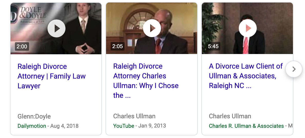
Search engine titans Google and Bing are now showing video content directly in the search results. Adding an optimized video to your website can improve your visibility in search engine results and overall legal marketing strategy.
Benefits of SEO Video Content:
- Improves UX
- Increases search engine visibility
- Helps you connect with your audience
- Condenses & easily delivers information
4. Micro-Animation Trends for Lawyer Websites
Micro-animations are small visual cues that draw the user’s attention. For example, when you move the mouse near our logo, it increases size and changes form, you’re seeing a micro-animation.
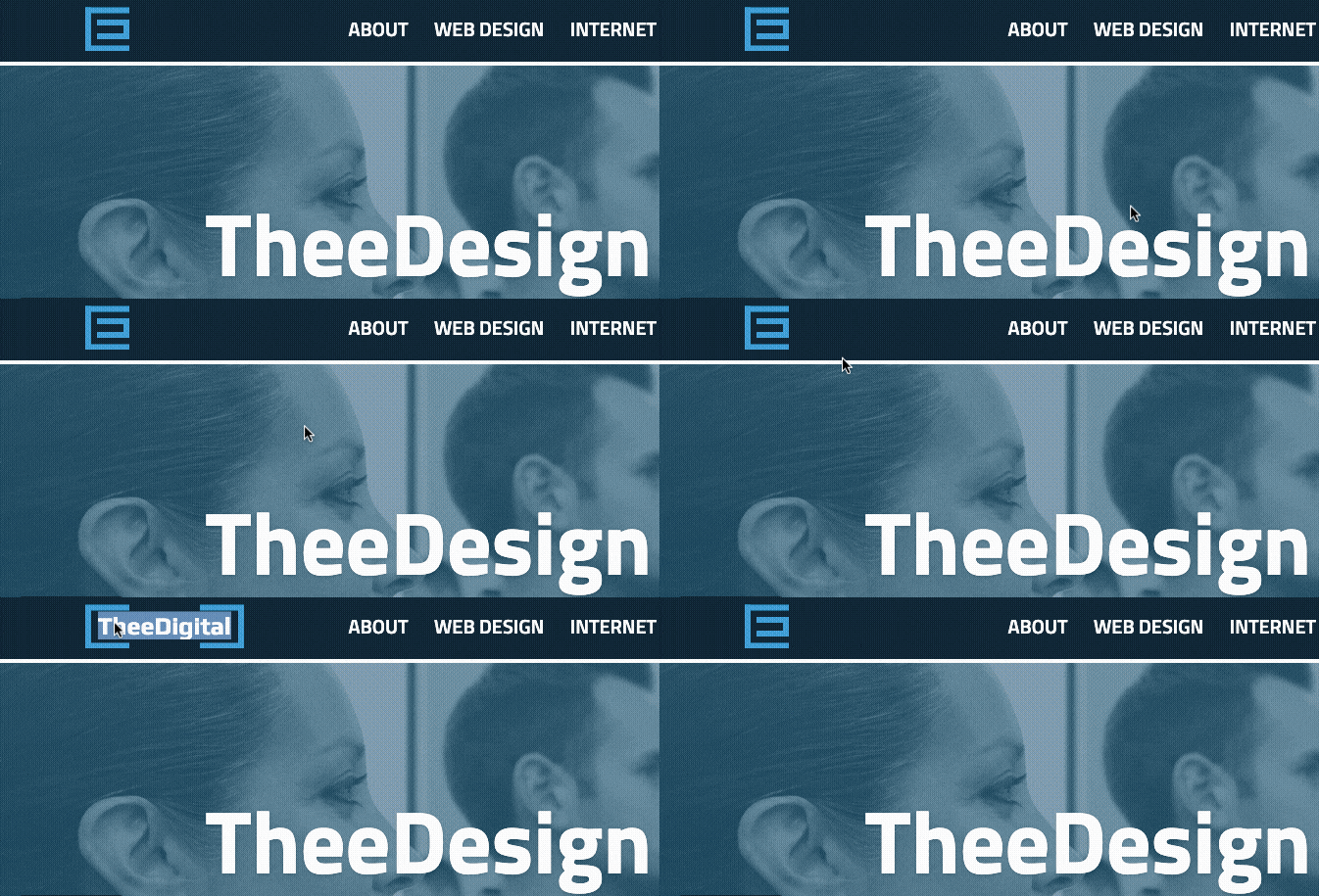
Micro-animations guide visitors around a website, subtly encourages them to follow your calls to action, and can also serve to keep users scrolling down a page. You can have interactive elements such as text that only glides across the screen when a user reaches a certain part of the page. Color changes and gradient shifts are also another popular micro-animation that’s controlled by scrolling behavior.
5. Minimalism
You’ve got a lot to say, but you don’t want to overwhelm your users with too much information. Presenting a clean user experience can help people stay focused when browsing a website. Minimalist web design is – well, minimal – in that it doesn’t rely on complicated graphics or extreme colors to draw the visitor in.
This doesn’t mean you skimp on the content or design elements. Rather, websites with minimalist designs are focused on the facts – and aren’t afraid of whitespace.
6. Chatbots
Instant gratification is in! How can you provide that to users? Chatbots.
Chatbots are functional tools that provide better user experiences for your prospects and clients. When set up properly, you can provide instant responses that help people understand whether or not you can help them with their legal issues. However, be aware of how you or your website development agency sets up the question and response sequences – if not thought-through, you may actually frustrate customers.
Final Word: Best Lawyer Website Design Trends of 2025
Not only are we looking forward to cleaner designs, more motion graphics, and directed experiences, but people expect a genuine connection when they visit a website. People are compelled to trust your “why” before your “what” or “who”. That said, what you put on your website matters. Review your website with your legal team or with a law firm website design agency to see how the voice and tone of your content marketing represent your brand as a whole.
Additional Lawyer Website Features:
- Write genuine content that connects.
- Build more guided experiences for your website visitors.
Looking for a legal marketing agency that can capture your professionalism, expertise, and knowledge? Let us help you take your law firm website design to the next level! TheeDigital has experience building and redesigning lawyer websites that convert. Contact the attorney web design and legal marketing professionals at TheeDigital at 919-635-5577 or schedule a free site audit.
Tags: Legal Marketing


