Products are Hard to Find
Ideally, for an ecommerce website, the product categories should be listed in the main navigation menu so they are front and center. They should be sorted into logical groups by how a customer would use a product or by the product type. For example, a clothing store’s site would be grouped into men’s, women’s, and children’s clothes, and then subdivided into items such as tops, pants, shoes, and more. For a food store, the options could be displayed by size, flavors, or occasion. Our blog on “How to Organize your Ecommerce Store for your Customers” can help you learn more about grouping your products into categories and using taxonomies. If your products are not listed in your main navigation or under a “Product” or “Shop” section, how are your users supposed to know you sell items on your website?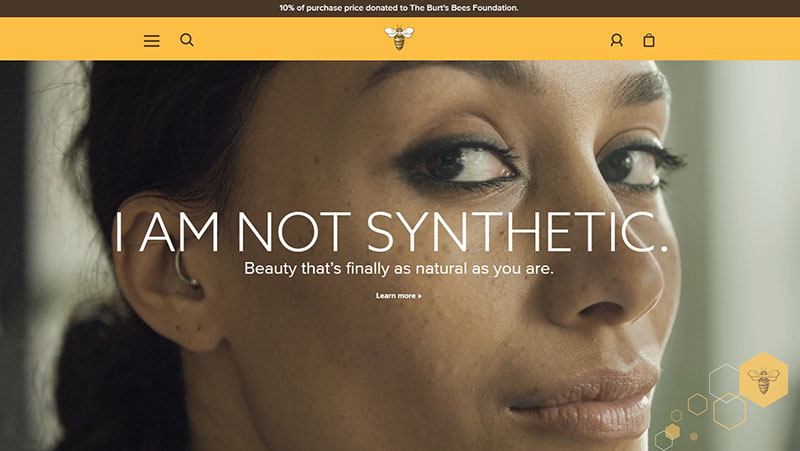
Hard to Understand Navigation
Your website’s navigation menu should contain terms that every user can understand. It shouldn’t include your corporate jargon or acronyms that a customer wouldn’t understand. For example, while “design your own” and “custom” may be two very different categories for your company, those terms are interchangeable to the average user. Your menu also shouldn’t include your internal product or style name – unless you’re a nationally recognized product like Air Jordan Sneakers – because a new user probably won’t recognize what it is. For example, a trampoline park may refer their tickets as a “flight pass”, but new users would probably be looking for a simpler term of “tickets” or “reservations.” In another example, a sock ecommerce site should include their products in the menu based on the activity the end user would wear the socks for – hiking, running, basketball, or tennis – versus sock product names. Unless a user has purchased in the past, they won’t understand what an “OAQU” or “84N” or “XDXW” sock is. A well-sorted, non-confusing navigation.
Forcing Customers to Create an Account
Forcing your customers to create an account is the #1 conversion killer. If a customer is required to create an account to place an order, it might be a reason why they are not buying from your site. See how your direct competitors handle needing an account – probably a number of them offer guest checkout options, therefore you should too. Many customers buy gifts on sites they don’t frequent themselves, such as for a wedding gift or baby shower. That gift-giving customer may have no intention of shopping on your website again. Forcing that person to create an account before they order the gift will make it less likely for them to want to finish that transaction. Some other customers might get frustrated trying to remember yet another set of usernames and passwords. Some may have concerns about the site storing their personal information and credit card number. Other customers may have concerns that creating an account will sign them up for your email newsletter, and they don’t want any more messages cluttering up their inbox. When you do ask your customer to create an account, be sure to share with them the benefit of doing so, such as being able to check on the status of their order or to get discounts on future orders.Product Page Issues
If you have good traffic to your website and an easy to use navigation, customers should be flocking to your product pages. A bad user experience once the customer visits those pages can be another reason they decide not to purchase on your website. Here are some product page issues that can result in people not buying from your ecommerce website:- No checkout button on product pages – Once a customer has added an item to their cart, it should be very easy for them to navigate to the checkout if they are done shopping.
- Product options unclear – If there is more than one size, color, or flavor available of your product, it should be easy for the user to select these options.
- No quantity field – If your customer wants to buy more than one of your product, they should be able to do so on the product page. Some websites are set up so you can only purchase one of an item at a time, forcing users who want to buy more than one to have to revisit the product page repeatedly – a bad user experience.
- No product image – If the item you are selling is a tangible item, you should show a picture of the product. Not having an image of something where looks matter, such as clothing, housewares, or decorations, will deter customers from purchasing from you.
- Missing breadcrumb navigation – When a customer is searching through categories, a breadcrumb navigation makes it easy for them to go back and return to the main category pages. If this navigation is missing, the customer may find they have to go back to the main menu and re-click through all the subcategories to get to the section they want – not an ideal user experience.
Pop-ups
Pop-ups can be a great way for you to advertise deals to customers, share new products, and get more newsletter subscribers. But for a lot of customers, pop-ups can be an annoyance and make them less happy with your website. If you do choose to have pop-ups on your site, be sure there is an obvious way to close the pop-up without having to fill out the form. If they can’t figure out how to close out the pop-up, users might leave your site altogether.
Shipping Rate is too High
If your shipping rate is too high, it could be another reason customers are visiting but not purchasing on your website. Ideally on an ecommerce website, the shipping rate for lightweight items within the US should be just a few dollars. This is especially true if your exact product or a very similar product is for sale on Amazon.com, whereby Prime members can get the item in just two days for no shipping cost. If you’re selling a product that weighs less than a pound and cost less than $100, a shipping rate over $5 would be considered unreasonable by a lot of consumers. Real life example: A few years ago, on the burtsbees.com website, a customer could purchase an individual lip balm for $2.99. To get that item shipped to them, it would cost $5.00. Or they could purchase that exact same item on Amazon for the same $2.99, add it the other items they were already buying, and pay no shipping fee. Or they could pick up that same lip balm the next time they were out at WalMart, Target, Harris Teeter, Whole Foods, CVS, and other retailers. Which option do you think most customers chose to do? It’s also recommended to offer a discounted shipping rate after a certain price point is met. Many websites have free shipping once you purchase $25, $35, or $50 worth of their product. Especially pay attention to your competition here. It’s not uncommon for users to look around your site, add items to their cart with every intent to buy, and then abandon the cart if your shipping rate is too high. And then most likely they’ll go to Amazon or your competitor who has a lower shipping rate and purchase very similar items from them.Shipping Takes too Long
Similar to the point above, if the shipping time on your site takes too long, you may be losing customers. It should be clear to your customers not only the shipping time to their location but also how long your processing time is. There’s a number of times I personally bought an item for an event based on the shipping time of two days but didn’t realize there was a three-day processing time prior to my item shipping and the item did not arrive for my event and I was disappointed. Again, Amazon Prime members can get items shipped to them within two days for free (starting to see a trend here?). Or with the new Prime Pantry, in certain cities, they can get items delivered to them in just two hours. So, if a customer visiting your website needs an item for this weekend and it’s a Tuesday, know that if your shipping and processing time are not fast enough, that customer may not end up purchasing through you. It’s understandable if you don’t have the infrastructure or your third-party logistics aren’t set up to be able to ship items quicker or to send them out of your location faster, but know that that may be an item affecting sales on your ecommerce website.Your Site is not Secure
Users may not be willing to enter their credit card information on your website if your URL does not begin with HTTPS. Per our blog about HTTPS security, “Communications over HTTPS are encrypted between the client and the server so eavesdroppers don’t listen in, no one tampers with the data, and your website data isn’t forged.” If your website does not have HTTPS security, when a user first visits your page, they may get a security error which includes the text “not recommended” about continuing to your website – which really doesn’t look good. Many users will stop at this point and not go through to your website at all. If they do continue to your website, they will probably be less confident to buy items on your site.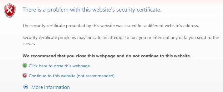
Looking for an experienced ecommerce development agency that can help you get more sales on your website? Contact our ecommerce development team in Raleigh, NC at 919-341-8901 or fill out our form to request a complimentary, high-level audit from our internet marketing experts.
Tags: Ecommerce • WooCommerce

