Choosing a web designer is like choosing a builder for your home. You want someone who is going to take pride in their work and build you something useful while still looking good. While we all want these things, sometimes the person we choose to take the helm isn’t doing the job you’re paying them to do.
If you’ve chosen a freelance web designer, they could be making mistakes that are not only costing you unnecessary money, but also potential customers. The bigger problem is that you may not even know what to look for to know that you’re not getting what you’re paying for. That’s why we’re here. We’re your eyes and ears when it comes to pointing out mistakes that your freelance web designer is making.
Check out our list of things you’ll want to look out for.
1. Brags Too Much Without Getting to the Point
You want searchers to know that you’re good at what you do but you need to give them more than that. If your web designer is presenting your website like a resume, beware. While testimonials and awards are great, they’re not the main course. You have to show the searcher that you have the services and skills they need to make their life better, not brag about yours.
2. Using Jargon Instead of Normal Language
Your website needs to be presented in a way that everyone will understand. You don’t want to use jargon or terms that people won’t be familiar with. For example, if you’re a lawyer, it’s probably natural for you to think and write in legalese. But it’s not for everyone else. You want to have information that everyone can understand. If not, they’re going to click away from your site to one that speaks their language.
3. Being Cute or Clever Instead of Clear
You may think you’re being cute or clever. But in reality, no one knows what you’re trying to say. Clarity goes a long way. Be sure your web designer is making clarity a priority over cute sayings.
4. No Calls-to-Action
If your website has no calls to action, your web designer is doing you a BIG disservice. Your website needs to tell people what to do because if not, they won’t likely do anything. You also need to tell them what they’ll get from taking action. Here’s a good example:
“Schedule a Treatment Today and Be Mosquito Free Tomorrow.”
This is clear and not buried in the fine print. This is what your goal should be.
5. Too Many Calls-to-Action
While you want to have calls to action, there is too much of a good thing. If you’re throwing people commands in every other sentence of your site, they’re going to get over-stimulated and probably annoyed.
Although they all may be actions you want your visitors to take, cramming them all on the same page only serves to divide your visitors’ attention. Each page should ideally focus on a single goal.
6. Using Unvetted 3rd Party Themes
While unvetted third-party themes may look fancy, they can slow down your site. We all know that’s a big no-no. Plus, they may not be compatible with your WordPress version. Keep in mind, a new version of WordPress comes out practically every month. WordPress updates can often be incompatible with your theme’s code, causing your site to break. Be sure your freelance designer is not using them because it will only hurt you in the long run.
7. Not Having Enthusiasm For Your Project
Your freelance web designer should be excited about working on your project. Yes, it’s a job. But, if they’re just muddling through it’s going to show in the end product which is your website. They’re still going to get paid and you’re left with a lackluster website. You want someone who is going to have fresh ideas and be excited about creating a killer website for you.
8. Using Cheap, Shared Hosting
You know the saying; you get what you pay for. If you’re using cheap, shared hosting, you can’t expect to have a lightning-speed site. It’s just not going to happen. Also, cheap hosting may not include regular backups of your site’s data. Such hosting plans are more prone to downtimes and lost data. A broken site with no backup is more than an inconvenience. It could be catastrophic to your business.
9. Overuse of Sliders
Beware if your web designer is slider happy. While sliders are a way to get multiple messages into one space, they can get slow and choppy. This is especially true on mobile devices. We know that people do most of their searching on the go. So, if they’re distracted by your sliders and can’t get the info they need, they’re going to click away.
10. No Google Analytics Tag Installed
How can you manage what you can’t measure?
Your website is the epicenter of your business’ public face. You need to track and measure what your visitors are doing to make intelligent decisions on what to do next. This is why Google Analytics is important.
Pro tip: While you’re in Google Analytics, make sure to add a filter to exclude your own IP address and the IP address of your web developer. That way you aren’t counting your own visits to the site as legitimate traffic.
11. No Conversion Tracking
Google Analytics isn’t just for looking at traffic statistics so you can feel like a scientist. Unless you run an online magazine and sell banner ad space as your main source of revenue, traffic and page views put precisely zero dollars in your pocket. Why use traffic as your measuring stick for success? You need to track the leads and sales generated from your website, and correctly attribute which channels (organic search, paid search, direct, email, social) they came from.
12. Not Using Google Search Console
Google Search Console provides you with important information about your site’s health, including indexing issues, broken links, mobile usability, and HTML improvements. It’s also where you can tell Google exactly how you want it to crawl and index your site. Not using Google Search Console makes it harder to know how healthy your site is.13. Preferred Site Version Not Set
Since we are talking about Google Search Console, one of the things you need to do in there is set your preferred site version. You have to choose whether your site should default to the www or non-www version.
For example, example.com and www.example.com would actually be considered two different web pages without a preferred site version set.
This matters for two reasons. If you have multiple versions of all your pages, your site is going to be full of duplicate content. Duplicate content sends a confusing signal to Google about what content on your site is most important. Don’t confuse Google. It can have a negative impact on your SEO,
The other reason you don’t want duplicates of your pages is backlinks. Backlinks are an extremely important ranking factor.
If incoming links are split between two versions of your page, that link authority, often referred to as “link juice,” is diluted among two pages. It’d be better if all that juice was going to the one version of your site that you were trying to rank.
14. No SSL Certificate
If your site starts with HTTP versus HTTPS, you don’t have an SSL certificate. If you don’t have one, your visitors may see a “not secure” warning in their browser.
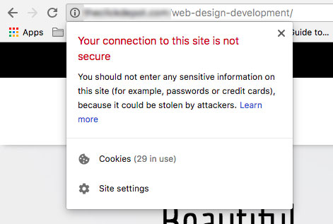
That looks a little scary. Secure sites, on the other hand, proudly display a happy green padlock symbol.

Google also officially has stated that having an SSL is a positive ranking signal. Thus, another reason to make sure your site has one.
15. Using Stock Images
If your freelance web designer is using some stock images, it’s not the end of the world. But that shouldn’t be all that they’re using. Stock photos seem fake and generic. Custom graphics and real photographs provide a feeling of authenticity. You want your visitors to trust you. Beyond trust, website imagery should speak to your target audience and help convey the benefits of your product or service.
Here is a brilliant use of imagery from Constant Contact.
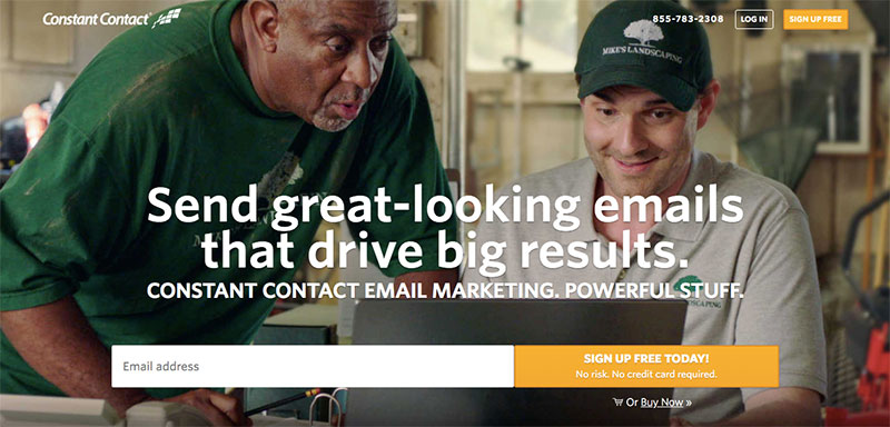
It’s a pretty normal-looking picture, but it says so much.
Constant Contact is an email marketing platform targeted at small business owners. They are well aware that their potential customers are all worried about the same things.
- Does this really work?
- Is it too complicated?
- Is this for people like me?
Notice the dirty green t-shirt, the smiling guy with the 5 o’clock shadow, the small business logo on the hat, and the fact that they appear to be doing this in a garage.
Think about what all these things subconsciously mean.
- This product is for no-nonsense, hard-working, busy entrepreneurs.
- The product is perfect for small businesses (like local landscapers) that probably don’t have huge marketing budgets.
- Anyone can use it.
- It’s not stressful.
- It works and it makes you happy.
16. Not Optimizing Image Size
Speed is crucial to a good user experience, and it’s also a ranking factor. Images with large file sizes take a long time to download, especially on mobile devices.
Images should be sized down to the actual dimensions of the space they fill. If you cram a 3000 x 1500 pixel image into a 300 x 150 pixel space, your visitor still has to download the full-sized image. After ensuring your images are the smallest possible dimension, they should also be compressed using Photoshop’s “save for web” function or a variety of other compression tools.
Last but not least, .jpg images should have their render setting set to “progressive.” This loads a lower resolution image immediately, which sharpens as the rest of the page continues to load. This is better than seeing a blank space and a red X while the file downloads and offers a better experience for your visitors.
17. Not Optimizing Image Alt Tags
Alt tags describe what a picture is about. From an SEO perspective, describing your images to search engine spiders is just another way to send a stronger signal of what your page is about.
Using alt tags also improves accessibility. People who are visually impaired may use specialized screen readers that read web pages aloud. For a screen reader to interpret an image, it needs to be described in words. The alt tag provides a way for you to help those using screen readers to read your site.
18. Using Poor Site Structure
For your human visitors:
People need to be able to easily explore your site intuitively and find what they’re looking for quickly. If they’re confused, they are more likely to hit the back button and go explore another site.
For search engines:
The information on your site needs to be clearly categorized and organized. This is often referred to as “siloing.”
It’s called siloing because silos are usually filled with one thing. On a farm, for instance, you’d have a silo full of corn and a silo full of wheat. You don’t put wheat and corn together in the same silo.
People search for ideas one at a time. No one Googles the phrase “Can I sue my landlord and should I get a will?”
Those are separate searches that deserve separate pages.
19. Too Little White Space
People tend to scan websites, they don’t read them top to bottom.
That’s why my paragraphs are so short, and there are headings, bullet points, quotes, and images to break up the text.
On your homepage or landing pages, white space is even more important. White space helps users focus on your main call to action. It helps to separate and to organize your ideas, and it helps encourage interaction.
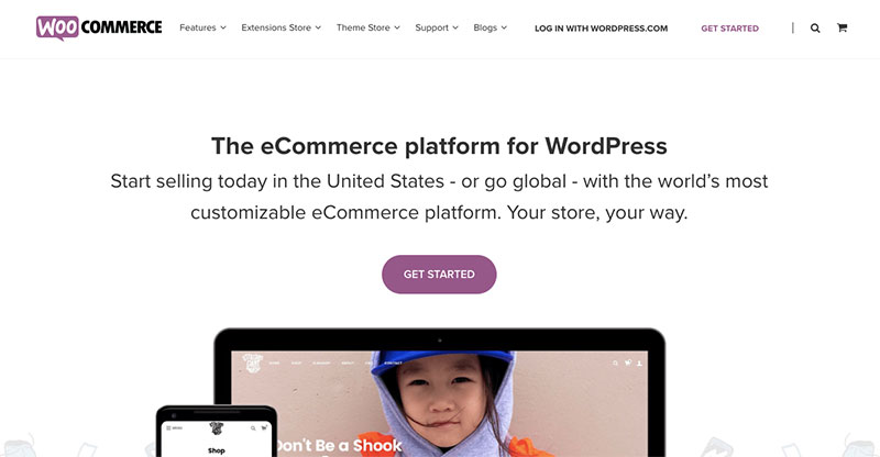
Less is more. Look at all that beautiful space.
20. No/Bad Title Tags
Let’s do a quick test: Pull your website up in a browser and look at the title in the tab. Does it say “Home” on it?

If so, your freelancer has ignored your title tag.
If you don’t know what a title tag is, it is exactly what you’d think. It is the title of your document. It should shout what your page is about. Your page is not about “home” so it should be shouting a different message.
21. No Content or Thin Content
Google needs to interpret what your site is about. It can’t do that with pictures or other non-readable content. This is why you need to have content. But not just any content. You have to give your readers something of value. Be a resource of valuable information.
22. Desktop First / Poor Mobile Experience
Web designers, developers, and marketers do their work on desktop and laptop computers. When you look at a full-sized screen 40+ hours a week, it is easy to fall into the trap of thinking that this is how everyone else is experiencing the work you’re creating.
In reality, statistics show that nearly 60% of all online searches are done on a mobile device. That number is only expected to grow. That’s why mobile experience needs to be a priority, not an afterthought.
23. Putting Aesthetics Over Function
Making art is fun but your website is not an art project. It is your business tool that allows you to connect with millions of people from all over. Its job is to convey information as clearly and simply as possible and to persuade visitors to take you up on your call to action. This is why some of the most minimal sites are the most successful. They’re straightforward and get attention.
24. Using H1s and H2s For Styling Purposes
This is a prevalent mistake among novice designers.
Heading tags (H1, H2, H3, H4, H5, H6) hold meaning. They imply a hierarchy of importance. They are not simply a means to change the font size. That is what CSS is for.
There should only be one H1 on a page, and this should closely mirror your page’s title tag.
H2s, H3s, and so on are all subheadings of decreasing importance. They should be used as titles for the sub-sections within your pages’ hierarchy.
25. No/Bad/Duplicate Meta Descriptions
Meta descriptions are what show up on search engine results pages under your page title.

Although meta descriptions are not a direct Google ranking factor, they are another way to clearly describe the contents of your page.
If your meta descriptions are especially well-written, you might enjoy a higher click-through rate on search engine results pages and get more visitors as a result. A higher click-through rate could also boost your rankings.
26. No Training On How to Use Your Site Once It’s Finished
Your site is done but do you know how to use all the bells and whistles your freelancer installed?
Does your freelancer have standard phone hours? A support department? A ticket system? Monthly trainings?
Your web designer should thoroughly explain all of your site’s functions. If not, then you’ve just wasted your money.
27. Not 301 Redirecting Old URLs
This could be one of the most dangerous mistakes your web designer is making.
If you have a well-established business, there’s a good chance that your website has acquired a lot of links, whether you actively sought out those links or they happened naturally. Many of those links will not be to your homepage. You might have links to blog articles, service pages, or product pages if you have an e-commerce website.
If you change your site structure and the location of these pages change, all those links will be pointing to 404 error pages. This is can really ruin your site from an SEO standpoint as well as with user experience.
28. No Team of Experienced Digital Marketing Experts on Your Side
When you put your website in the hands of one person and they’re suddenly MIA with all of your logins, you’re left with a site you can’t access. You want to have all the vital information about your site in case this happens. Without a team of people behind your web designer, you’re putting a lot of trust in one person who could potentially force you to start from scratch if they suddenly take off.
If you want a digital marketing team to develop your site with steady growth and reliable service, call the digital marketing experts at TheeDigital today at 919-341-8901 or fill out our form for a free consultation.
Tags: Digital Marketing • Search Engine Optimization • Web Design
