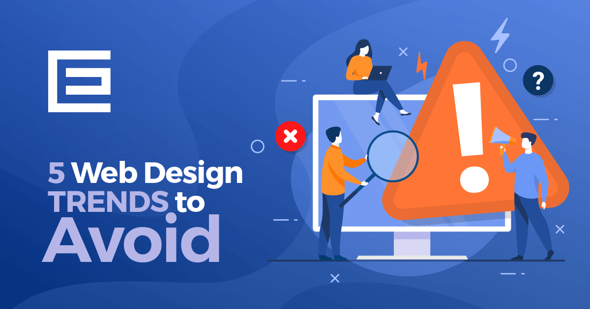
We all want our website to impress potential customers and stand out from the crowd. However, some web design trends intended to make a site unique actually hurt the customer’s experience. Let’s face it, it doesn’t matter how good your site looks if it does convert visitors into customers. Just because something is new, doesn’t mean it’s necessarily right for your site.
Here are 5 web design trends that you should avoid and why!
Using Stock Imagery
A picture is worth 1,000 words, right? If you choose to add stock imagery to your website, those 1,000 words are saying: lame, boring, unoriginal, uninspired, trite, worn. Stock images have their uses, the most effective of which is a placeholder until you can get your own imagery to replace it. The images may look nice. They are staged, have attractive people in them, and they are much easier to acquire than setting up a photo shoot in your place of business, but in the long run, candid real images will perform much better.
We have all been to websites that are packed with stock images, some of those images you probably even see on more than one site. Studies have shown that decorative, generic images are often ignored by site visitors. Replace them with original and real photos that represent your brand’s content and personality. That device you are currently reading this on can take high-resolution images of your office, staff, and products/services that can look great on your site, so you have no excuse.
For best results be sure those fresh images are optimized properly for SEO, which you can learn about on our blog. And before you take the picture, make sure you are holding your device horizontally. Landscape photos work much better on websites than portraits.
Replacing Text with Images
You have heard the adage that “Less is More” right? Well, not in this case. That sleek looking website with hardly any text and large beautiful images may look incredible, but won’t perform well with search engines. Replacing the text on your website with an image will hurt your SEO. When Google or other search engines crawl your website they are looking for text. Don’t get me wrong, they look at your images too, but what really tells Google what your site is about is the written text on the page. No one will care how pretty your site is if they can never find it.
This goes for any documents you plan to include on your site. If you have a whitepaper with useful facts about your industry knowledge, instead of including it as a PDF file, create a blog or service page to complement the whitepaper. The content can then be crawled by Google and help your ranking.
Poorly Designed Landing Pages
Congratulations, you have appeared in the search results in front of your ideal potential customer. Unfortunately, that is only a half measure. We now need to convert this valuable and interested party into a customer. The most effective way to do this is to give them access to the information they are looking for right away.
Seems simple enough, but many businesses don’t do this efficiently. If your website visitor was searching for heating services, the page they land on should be about heating services, and only heating services. If they land on a page that talks about heating, air conditioning, duct work, and a list of other services that then requires the user to click deeper into the site, you may be sending your valuable traffic away by burning your most important content. Make the information that is important to the user easier to find and they will be easier to convert into a customer.
Having effective landing pages may require you to build out more pages on your site. They should be specific to the service you are talking about. No need to include heating and AC maintenance on the same page, separate them. As an added bonus, this expanded content will do wonders for your SEO and search engine ranking.
If you would like more information about how to build high quality traffic converting landing pages, contact the experts at TheeDigital today.
Outdated Fonts
It is truly amazing how something as simple as your font choice can completely change the feel and look of your website. You can read exactly the same text with different fonts and it can produce a myriad of emotions. When designing your website make sure to keep this in mind.
A good place to start when considering which font to use is your logo. It is already a showcase of your brand image, and if it was designed with the essence of your business in mind, should match up with the attitude and messaging on your website. Try to choose something that is unique, but easy to read. The last thing you need is for your users to have to read something multiple times to understand what you are trying to say.
Most websites have 2, possibly 3 different fonts. Something for the headlines and another for the body copy. Consistency is key here. The more fonts, and for that matter text sizes that are used, the more discombobulated and difficult to read your message becomes. Remember, we aren’t here to show off how exotic we can be, we are trying to tell the story of your business and why the person that is on the site should choose to do business with you.
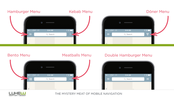
Non Standard Icons
If your site’s navigation is represented with icons, be sure to use one that users recognize. For the smartphone view, the stack of three lines (referred to as the Hamburger) is commonly used for navigating the menu. While you might have fun coming up with a different look for your mobile navigation, it will hurt your user experience if you stray too far from the norms.
If you’re displaying social media icons on your site, use the standardized look for those as well. The social media sites have branding guidelines so you can be sure to include the proper one in your design. For example, Facebook’s icon is a lowercase f with a blue background. Creating your own with an uppercase F that is pink could make it hard for your users to recognize the branding. Twitter and Tumblr both use a lowercase t, so having the correct color and having the period after the t for Tumblr is also important for brand recognition.
In Conclusion
If you take anything away from his article, let it be that your website is a representation of your brand. In many cases it is the first impression you get to make. A new visitor to your website should get a feel for exactly how you do business by the style and content that is on the page.
Tags: Web Design