Our 7 Favorite Homepage Hero Images (That Also Convert!)
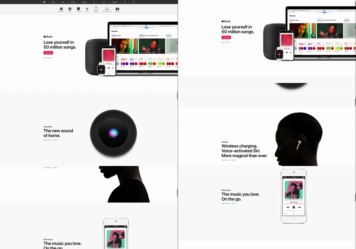
1. Apple.com
While you may prefer an Android device over Apple, nobody can deny Apple’s effective website design. The king of white space and minimal design, Apple has always put their products first. They’re so focused on this that their entire homepage, for every product section, essentially consists of GREAT hero images.
2. Pepsi.com
So, Pepsi failed me when it came to their contact page in my last article when I compared them to Coca Cola, but they absolutely win the homepage hero battle. The homepage video fits perfectly with the text, as it truly makes the product look delicious and refreshing.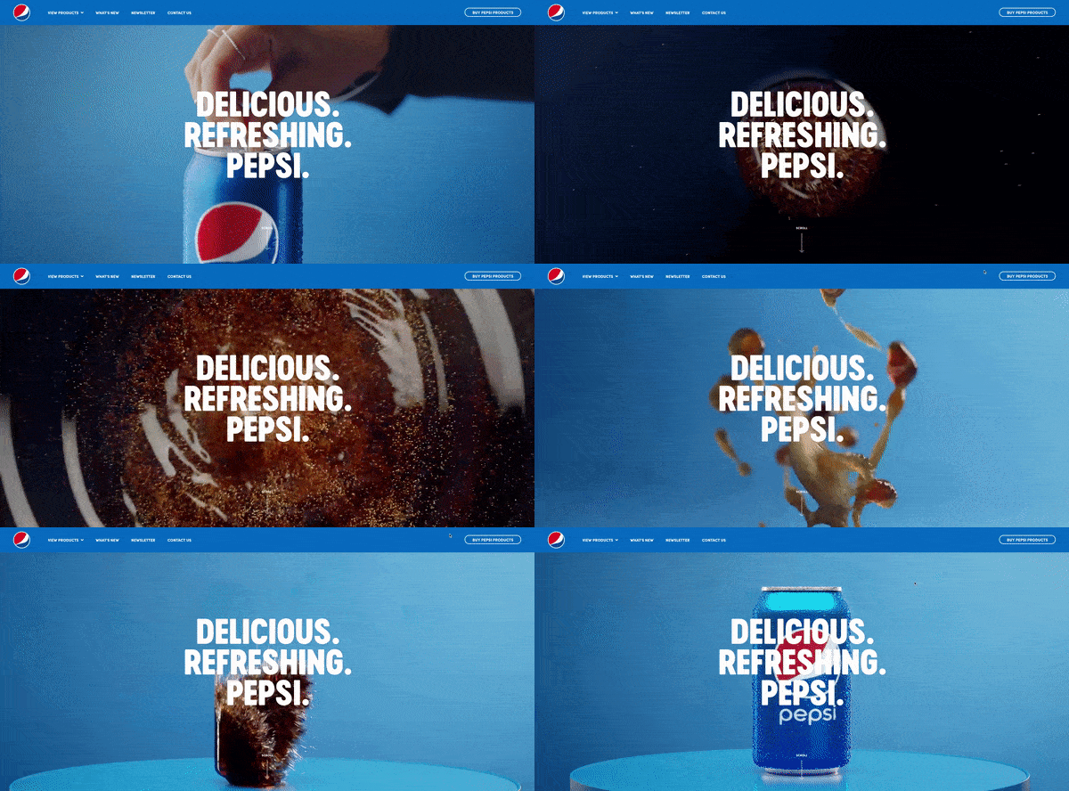
3. Smashmallow.com
Smashmallow uses very subtle animations to keep your eyes moving around. If a hero image can keep your attention then it has worked. The longer you stay on the site, the more likely you are to engage and buy in. In fact, give me a moment while I buy some Mint Chocolate Chip marshmallows from this site. Brb.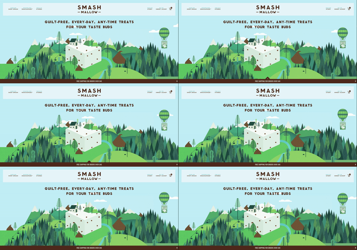
4. AirBnB.com
When creating your homepage, think about the emotion you want to evoke. AirBnB has invested most of the hero real estate to the image, showing the customer that they, too, can stay at an incredible location. Beautiful scenery and trips are not just for Instagram influencers!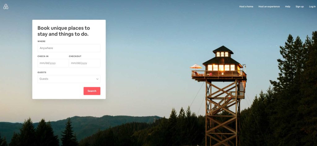
5. allbirds.com
allbirds’ homepage layout draws the eye from the top of the page, straight down to the shoes, followed by the shop buttons. The image itself has just enough motion, from the angles of the feet and the skirt, that we stay on the page a little bit longer to learn about their products.
6. CatScarf.com
Even if the internet did not love cats more than your crazy aunt, this hero image would still evoke emotion. And for your customer, this can help push them to browse your site, and ultimately buy something. Their homepage hero is such a simple image, but it’s just too precious to ignore.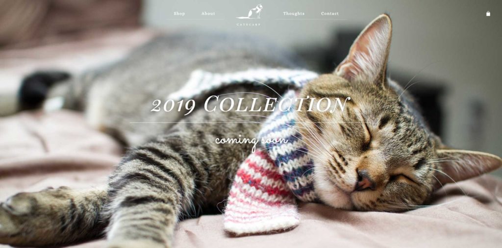
7. YoungbergFamilyLaw.com
This family law attorney gets you right in the feels. If you’re going through a divorce or any issues involving your children, an image like this is much more captivating and relatable than an image of lawyers or a cityscape. Youngberg Family Law did a great job creating a homepage hero that speaks to their target audience’s challenges when going through a divorce.
A Few Final Notes
Your homepage’s hero image is the first thing a visitor is going to see, so we recommend you take the time to really think about the right message you want to convey.- Emotion is a big factor. Evoking the right emotion can instantly build trust with your customers or push them away. Do not put just any ole stock image in the hero. Think about what feeling that image evokes and will it be felt by someone viewing your brand/website.
- Stock photos don’t work for every business. For example, if you specialize in custom clothing you should show your actual work and not stock images. However, if you are a dry cleaning company, a stock image of clothing is perfect.
- Hiring a professional photographer to take photos for your homepage is worth the investment. Maybe you’re a local baker, but you do not have the images you would like for your website. In this scenario, stock photos could result in a customer looking for that item in your shop. If they don’t see it they could get upset (and nobody wants a bad Yelp review).
One More Thing!
You may have added a landing page to your site, and if that’s the case I hope you have considered the imagery there as well. If not, see why landing pages are important here.Like these homepage hero images and want something similar for your website and brand? Let us create a visually interesting hero for your website! Contact the web designers at TheeDigital in Raleigh, NC at 919-341-8901 or schedule a consultation.
Tags: Web Design

