Black Friday web design looks about as chaotic and intense as the shopping holiday itself. Shouldn’t these big brands know better?
The following are some examples of brands we all know and love, whose otherwise user-friendly and eye-pleasing websites have transformed into black holes of shameless sales event promotion.
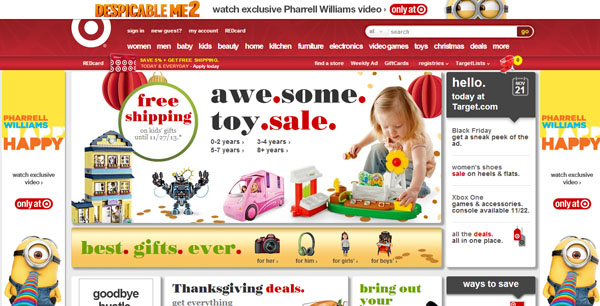
Target Black Friday
I am normally a big fan of Target’s marketing efforts. They always put a great deal of thought into their strategy, content, and design. But their website transformation for the holidays is overwhelmingly bad. They have crammed far too many call-to-actions onto one page. When everything is made to stand out, nothing stands out.
The Despicable Me banner ads totally surrounding the website adds to the confusion. And. Do. I. Have. To. Point. Out. How. Annoying. This. Is. To. Read?
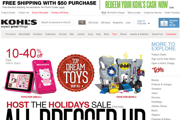
Kohl’s Black Friday
Kohl’s has made the same mistake as Target: too many call-to-actions. It’s clearly important that they emphasize the free shipping deal. Holiday shoppers demand (and have almost come to expect) free shipping this time of year because so many retailers have set a precedent. But the message loses its impact with multiple other call-to-actions strewn across the page.
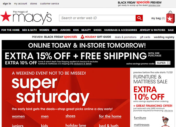
Macy’s Black Friday
The Macys.com website is a little nicer than Kohl’s and Target’s. It only has 4 major call-to-action messages, and they aren’t all crammed into the header. The layout has a little more breathing room, but not much.
Bonus: Can you spot the multiple promo codes tucked into this page? I bet if we look hard enough, we might even find Waldo!
Tags: Digital Marketing • Miscellaneous • Web Design


