In our current work from home environment websites have become more important to our businesses and daily interactions with our clients. Having your website work for all your clients has become more important than ever.
A Brief History of ADA Compliance and the Internet
All federal, state and local government websites are required to meet accessibility standards under Section 508 of the Rehabilitation Act of 1973, which was updated in 2001 to include internet and intranet information and applications.
While there is some gray area about what regulations apply to privately owned companies, in 2017 the Southern District of Florida ruled in Gil v. Winn-Dixie Stores, Inc. that the ADA regulations in Section 508 applied to Winn-Dixie’s website, although Winn-Dixie is currently appealing the suit. Then again, in Robles v. Domino’s Pizza, LLC in October 2019 the Ninth Circuit Court ruled that the ADA regulations should be applied to the Domino’s Pizza website, but gave no clear regulations on what accessibility standards needed to be met. This ruling also left it up to the courts to decide on a case by case basis if the ADA regulations should apply to each company’s website. These cases have prompted a rash of lawsuits for websites that don’t meet the Web Content Accessibility Guidelines (WCAG) 2.1, which are considered the current best practices.
Does My Website Need to Be ADA Compliant?
Title I of the Americans with Disabilities Act (ADA) does provide an exemption for private clubs and religious organizations, so websites for these groups are also exempt. Other parts of the ADA allow for exemptions of small businesses that employ less than 15 people, but it is unclear if this applies to websites. The ADA requires that any business, regardless of size, make all reasonable efforts to accommodate customers with disabilities, but fails to provide further clarity on what is considered reasonable efforts.
Title III of the ADA pertains to the public accommodations to private businesses and nonprofits. Title III states that in general it applies to any “(1) Public accommodation; (2) Commercial facility; or (3) Private entity that offers examinations or courses related to applications, licensing, certification, or credentialing for secondary or postsecondary education, professional, or trade purposes.”
This does provide clarity for any websites offering educational materials since they are specifically mentioned in the law. However, for other business entities, it can be argued that your company’s website is a “public accommodation” of your company and that case has been made in court. The First, Second, and Seventh Circuit Courts of Appeals have all upheld cases claiming that public accommodations should apply to websites. However, the Third, Sixth, Ninth, and Eleventh Circuit Courts of Appeals have all stated that a place of public accommodation had to be a physical location.
In 2018 Congress asked for clarification from the Department of Justice and Assistant Attorney General Stephen E. Boyd responded in a letter by saying:
The line “…noncompliance with a voluntary technical standard for website accessibility does not necessarily indicate noncompliance with the ADA.” is significant and means the DOJ is not prepared to make the gray area of the law black and white. They basically put the issue back to congress and ask them to “provide clarity through the legislative process”
While the Executive, Legislative and Judicial branches of government have all failed to provide a clear answer, many private industries are dealing with these issues in litigation.
Given all of that, the short answer is:
It may not be legally required for your site to be ADA compliant right now, but it may be in the future and it is just a good idea.

Here Are the Top 5 Things You Should Do to Make Your Website ADA Compliant
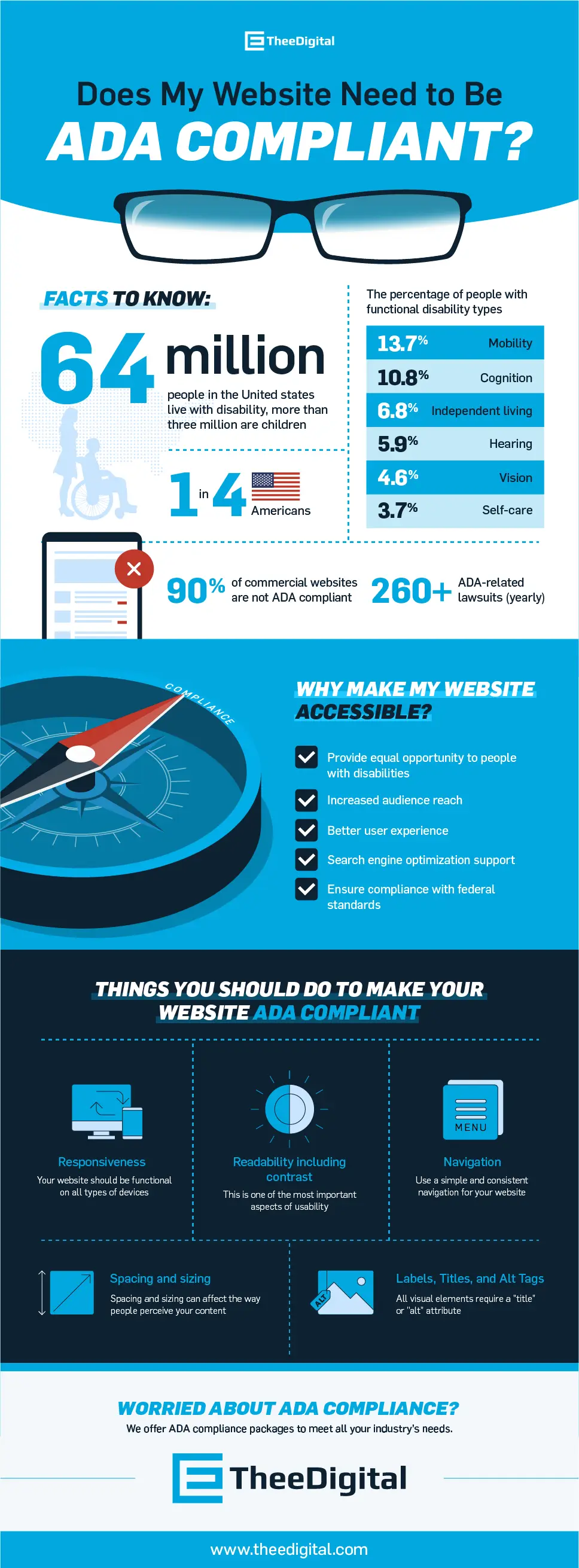
Your Website Must Be Responsive
People with disabilities often find it easier to use a tablet or smartphone to browse the internet. Your website should be functional on these devices by scaling to the different screen sizes and changing to fit the different formats. Some functions such as hover effects work well on desktops or laptops, but don’t function on touchscreen devices, such as tablets and smartphones, so the content shown on a hover will have to be displayed another way. Most websites fix this issue by making the content available on a click instead.
Responsive websites are commonplace for most website platforms.
Easy-To-Use Navigation
Most people think of the menu at the top of the page when they hear the words navigation and website together. For our purposes, we are talking about how one will move through your website to read or collect the information it has to offer. For the visually impaired it can be a challenge to move from one section to another if the site is not structured properly. Tab navigation allows your user to easily move through the site using keyboard shortcuts. Most screen readers rely on this type of navigation to read the website in the right order.
For people with physical disabilities, this tab navigation might be the only way they are able to access your site. If this function is not working properly they could abandon your site entirely.
Don’t Forget the Labels, Titles, and Alt Tags
Buttons, Images, Icons, and other visual elements on your website need to be functional for all users. To accomplish this these elements will need to be labeled properly for all devices and tools to be able to identify and interact with them.
Buttons should always have a title attribute that is the same are the text on the button. For example, a user with a tremor could use a voice activation program to interact with your site, so they will say the word that appears on the button, like ‘send’ in order to submit a contact form. If that title on that button is ‘submit’ the program will not be able to identify the button and the action will fail. This can be very frustrating to the user and will result in a loss of a lead for you.
Much like the buttons, images need an attribute to help identify them as well. For an image, this is the ‘alt’ tag. This attribute should be included on all images and should describe the image, so it gives the user the information they would get from viewing the image. If the image you are showing is of two happy people smiling but is located in your testimonials section the ‘alt’ text could read “photo of two happy customers”. Without the ‘alt’ attribute the screen reader will not be able to interpret the image for the visually impaired.
Icons have the same issue as images, but they are handled differently. They are a mix between the button and the image. Since most icons are an SVG or font the ‘title’ attribute will be used for these like the button, but the value will be the description like with the image.
Other visual elements may require a ‘title’ or ‘alt’ attribute as well.
Element Spacing & Sizing
In web layout, there are two ways to create spacing; padding and margins. Adding padding to an element adds spacing inside the element between its edge and the content. This will allow you to make an element larger. The margins will add spacing around an element to give it a bit of breathing room.
For someone who has tremors or a loss of hand-eye coordination clicking a small button can be difficult. To make this process easier for all users adding padding the buttons will give them a larger target to click and adding margins around the target will make it easier for the user to find the right selection and not hit an adjacent element by accident.
Readability & Color Contrast
The most important thing to know for readability is all text should always be text. This seems straightforward but isn’t. People will add words in an image or add simple PDFs to websites without an option for the screen reader to be able to read the information contained. The ‘alt’ attribute on the images should solve the issue for most images, but this is not an option for a PDF. If possible you should create a page for the PDF and give the user the option to download a PDF, but have the information available in another format. All PDF information should be accessible as text whenever possible.
According to the NIH, color blindness occurs in about 1 in 12 males and 1 in 200 females. To make sure this population can read the content webpages you will need to pick contrasting colors to provide readable text for all. White background with black text is a safe bet, but a green background with blue text can get into tricky territory. There are tools you can use to quickly check if your colors meet the contrast requirements.
- https://contrast-ratio.com/This tool checks two colors against each other and gives you a ratio for the set. Anything above 4.51 is passing and can be read by all users.
- https://color.a11y.com/This tool allows you to type in the webpage url and get a report on which elements pass and which elements fail. This will allow you to test your site for contrast compliance and see which elements need to be adjusted.
To supply your users with the best experience, readable text is the best place to start.
As we continue to become a more technology-based society, website accessibility will become more important to your business.
You never want to lose business due to a poor or frustrating experience a customer has with your website.
Here at TheeDigital, we offer ADA compliance packages to meet all your industry’s needs. Call 919-341-8901 or request a free ADA compliance audit today!
The current standard to the Web Content Accessibility Guidelines (WCAG) 2.1
The only official exemption to the ADA is for companies with fewer than 15 employees, but even smaller companies will want to comply with as many guidelines as possible to make their website available to as many customers as possible.
Section 504 requires companies to comply with the ADA for public accommodations among other things. Section 508 pertains mostly to federal, state and local governments, but is the section that clarifies web accessibility. Both sections of the law are important to the topic of ADA compliance of websites.
There are many tools that are available to scan your site for compliance. WAVE is a good tool to start with and be able to locate the main issues: https://wave.webaim.org/
There is not a foolproof guarantee for avoiding lawsuits, but making an effort to meet the compliance standards can only help you if someone attempts to bring a suit against your company.
We can help! We offer maintenance packages for keeping your site ADA compliant.
A is the lowest standard and AA rating is recommended. The AA standards include thing such as the button instructions for screen readers that the A level rating does not require.
These are basically the same guidelines, but 2.1 has been updated to include screen orientation, hover/focus content, label names and status updates among other things.
Yes, if you have another option to accommodate those that are not accommodated on your site you can provide that option instead.
Most ADA compliance changes have to be made within 180 days of becoming aware of the issue.
Tags: ADA Compliance • Our Favorites


