Your digital presence matters. Discover the best law firm website design trends for 2026 to build trust, attract clients, and drive more case inquiries.
You understand the power of representation. If your website looks outdated, isn’t secure, or loads slowly, then what does that say about your legal team? Make sure your law firm website design sends the right message with services from experienced law firm website designers that leverage the top law firm web design trends of 2026.
- 1Quick Summary: Top Law Firm Website Design Trends for 2026
- 2Top Law Firm Website Design Trends for 2026
- 3AI-Optimized Structured Content
- 4Mobile-First with Core Web Vitals
- 5Full ADA Accessibility Compliance
- 6E-E-A-T Credibility Elements
- 7Secure Client Intake Flows
- 8Local SEO with Schema
- 9Integrated Implementation Strategies
- 104 Essential Elements of Attorney Website Design
- 11Conclusion
Top Law Firm Website Design Trends for 2026
As web design for law firms advances in 2026, leading website design firms emphasize strategies that enhance trust and conversions. Law firm web design now integrates AI visibility, speed, and security to meet client expectations. Here’s a curated list of key trends shaping attorney website design.
| Trend | Best For | Key Benefits |
|---|---|---|
| AI-Optimized Structured Content | Visibility in AI searches | Rich snippets, E-E-A-T boosts |
| Mobile-First Core Web Vitals | Speed on devices | Better rankings, lower bounces |
| Full ADA Compliance | Inclusivity & risk reduction | Wider reach, legal protection |
| E-E-A-T Elements | Building trust | Authority via bios/reviews |
| Secure Intake Flows | Conversions | Safe, efficient inquiries |
| Local SEO Schema | Map pack dominance | Geo-targeted rich results |
AI-Optimized Structured Content
Website design for lawyers in 2026 prioritizes content that feeds AI overviews and zero-click searches. Law firm website designers use schema markup extensively—for FAQs, attorneys, organizations, and reviews—to earn featured positions in AI results and rich snippets.
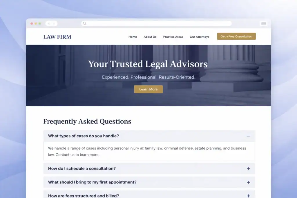
This approach ensures your law firm website development aligns with how potential clients discover legal services today. Implement structured data on service pages with clear headings, bullet-point processes, and conversational FAQs that directly answer high-intent questions like “how to file a claim” or “what are my rights after an accident.” On attorney bios and case results pages, include authored dates, expertise signals, and linked reviews to strengthen E-E-A-T for AI citation.
Mobile-First with Core Web Vitals
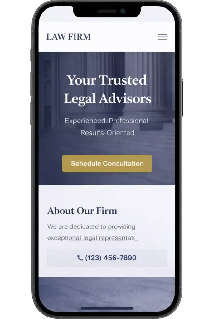
Law firm mobile website design remains critical as most legal searches happen on phones, often in urgent situations. Web design for law firms focuses on fast loading, smooth interactions, and intuitive navigation to prevent high-intent visitors from bouncing.
Leading website design firms target excellent Core Web Vitals scores—LCP under 2.5 seconds, INP under 200ms, and minimal CLS—for better mobile rankings and user satisfaction. Achieve this with responsive layouts, large tap targets for forms and CTAs, optimized images, and deferred scripts. Place prominent “Schedule Consultation” buttons above the fold on service pages, attorney bios, and location sections to guide mobile users quickly to action.
Full ADA Accessibility Compliance
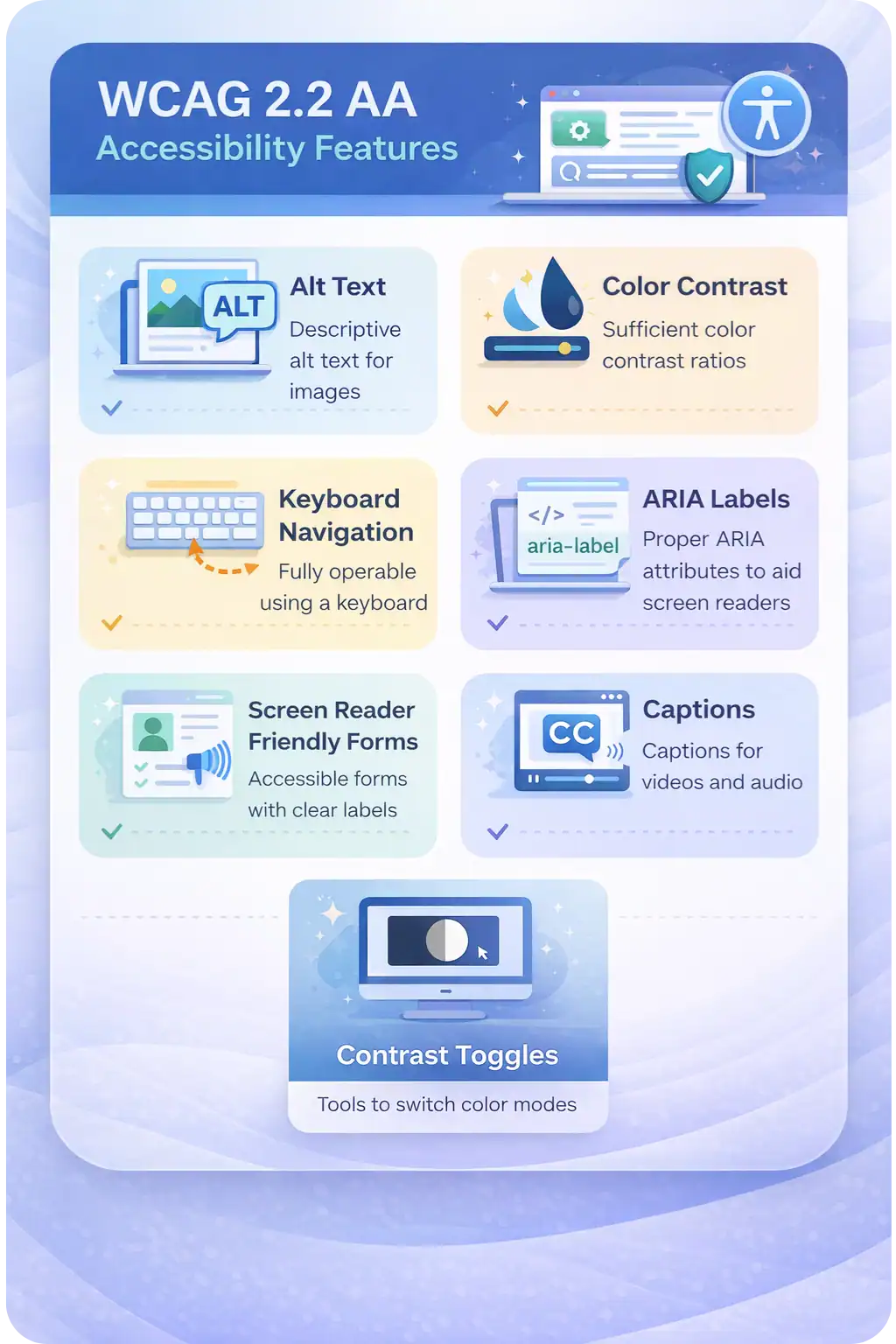
Modern law firm website design includes full WCAG 2.2 AA standards to avoid risks and reach more clients, including those with disabilities. Website design for law firms adds features like alt text for images, sufficient color contrast, keyboard navigation, and ARIA labels throughout the site.
This not only reduces lawsuit exposure but enhances UX for everyone and supports SEO. Ensure intake forms are screen-reader friendly, videos have captions, and include an accessibility statement with tools like contrast toggles in the footer. Partnering with experienced law firm website designers ensures these elements integrate seamlessly into your overall law firm web design.
E-E-A-T Credibility Elements
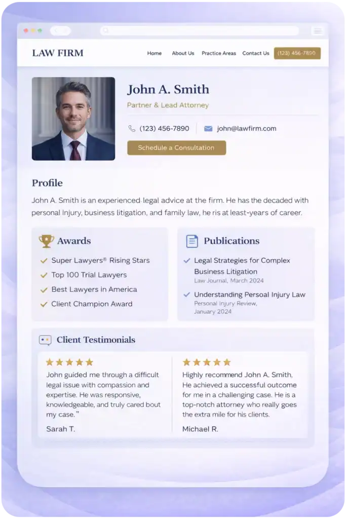
Attorney website design builds immediate trust with strong E-E-A-T signals—Experience, Expertise, Authoritativeness, and Trustworthiness. Law firm website development integrates detailed attorney bios with professional photos, bar admissions, awards, publications, and client testimonials.
Dedicate pages to anonymized case results showcasing verdicts and settlements. Embed verified reviews from Google and Avvo on the homepage, service pages, and bios. Add “As Featured In” sections with media logos to reinforce authority, helping law firm website designers create a credible, client-focused online presence.
Secure Client Intake Flows
Lawyer web design streamlines conversions with secure, user-friendly intake processes. Law firm website designers embed encrypted, compliant forms (often HIPAA-aligned for relevant practices) on every key page to capture leads efficiently.
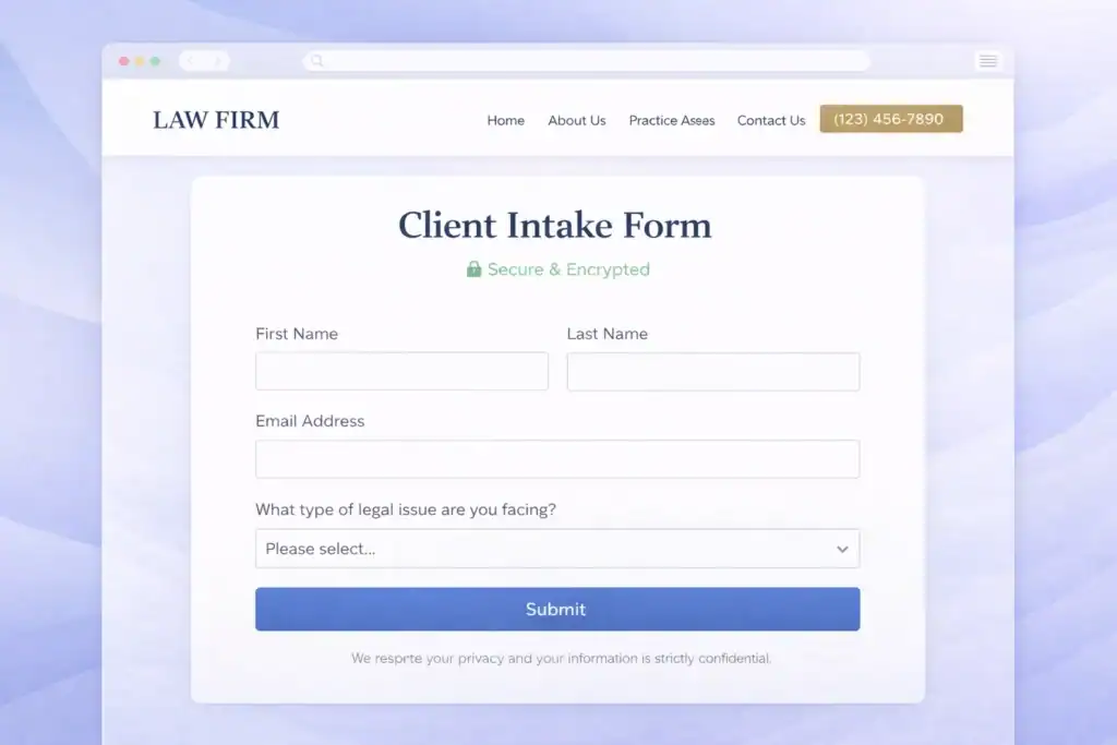
Use progressive disclosure—start with simple fields like name and issue type, then branch based on practice area. Integrate e-signatures, secure portals for document upload, and automated follow-ups via chat or scheduling tools. This privacy-first approach in law firm website development reassures clients while boosting retention rates.
Local SEO with Schema
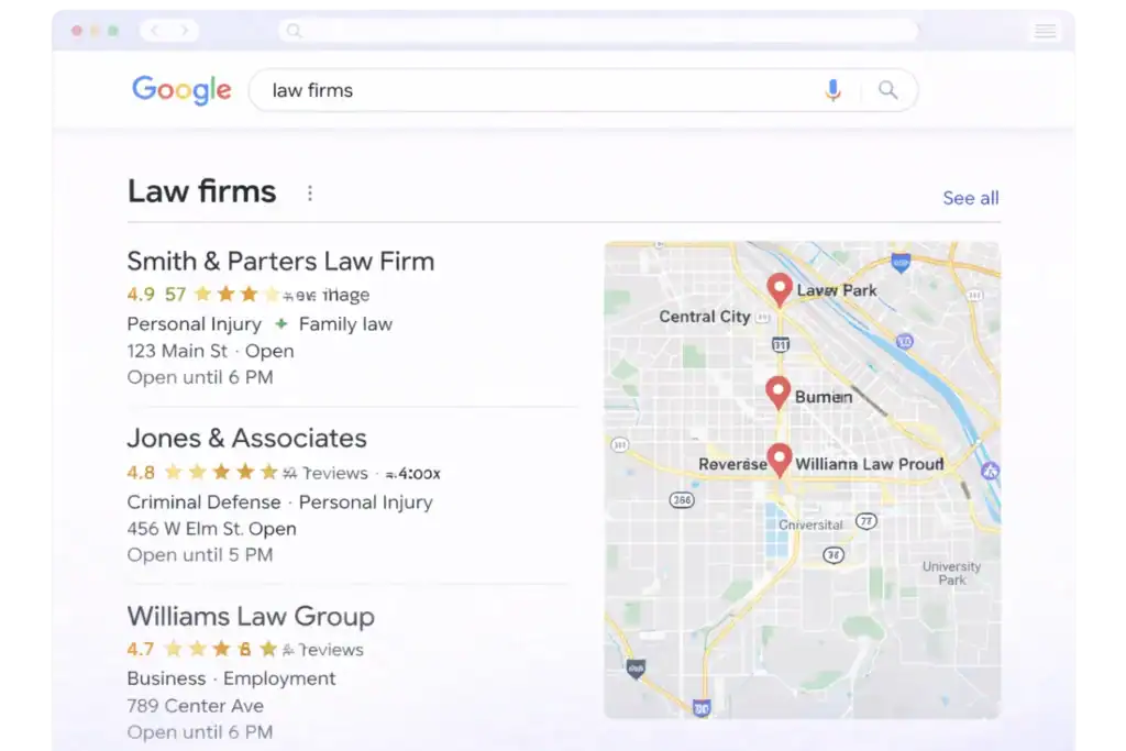
Web design firms enhance local visibility with integrated maps, reviews, and schema for dominant map pack performance. Website design for lawyers includes city-specific landing pages, embedded Google Maps, and LocalBusiness/Review markup.
Link these elements from bios, service pages, and footers to reinforce geo-signals. This strategy in law firm web design drives targeted traffic from “near me” searches.
Integrated Implementation Strategies
Successful law firm website development combines these trends cohesively: Use AI-friendly structured FAQs on practice area pages, link E-E-A-T-rich bios to case results, embed secure intake forms with local schema ties, and ensure everything performs flawlessly on mobile with ADA features. This holistic law firm web design creates intuitive paths—from discovery to consultation—maximizing trust and conversions.
4 Essential Elements of Attorney Website Design
While the latest trends drive innovation in law firm web design, every successful attorney website design still rests on these timeless foundational elements that ensure strong user experience and search performance.
- Mobile-friendly, responsive design that adapts seamlessly to any device—critical as most legal searches occur on smartphones, preventing frustration and lost clients.
- User-friendly navigation with clear menus and logical site structure, allowing visitors to quickly find practice areas, attorney bios, or contact information without confusion.
- High-quality, valuable content that demonstrates expertise and answers client questions, building trust while supporting SEO and E-E-A-T signals.
- Optimized performance with fast loading times and technical best practices, reducing bounce rates and improving rankings in an increasingly speed-focused search landscape.
These core principles provide the stable foundation that allows advanced 2026 trends to deliver maximum impact in law firm website development.
Best Lawyer Website Design Trends of 2026
Embracing these law firm website design trends in 2026 positions your practice for sustained growth in a competitive digital landscape. Partner with experienced law firm website designers to implement modern, effective web design for law firms that reflects your expertise.
Embrace These New Law Firm Website Design Trends in 2026
Looking to elevate your attorney website design? Contact TheeDigital’s law firm website designers at 919-341-8901 or fill out the form below to schedule a consultation.
Tags: Legal Marketing
