The 404 (or Not Found) error message is an HTTP
server response code that means the page you were trying to reach couldn’t be found on the server. This doesn’t mean anything is wrong with the website or server, but that the specific page is unavailable. When the server can’t find the page, it shows the 404 page.
*Web pages could be unavailable for a variety of reasons, however it’s most likely due to improper redirects or mistyped URLs.
Below we’re sharing why you need a 404 error page and a few of our favorite 404 page examples.
Why You Need a 404 Page
For the user, a 404 page can be annoying because they can’t find what they’re looking for. However for you, the website owner, they provide another way to engage users and show off your brand personality.
They’re also beneficial to your overall
SEO strategy. Having a 404 page that engages users prevents them from hitting the back button and returning to the search results. If this were to happen pretty often, Google would notice and show your site less often in the search results. Google only wants to provide valuable information, and if people are continually leaving your site (or a page) they won’t display it in the results as often.
Thus, the need for an engaging, brand-focused 404 page.
Our Top 5 Favorite 404 Page Examples
1. Medium.com
Why This Works
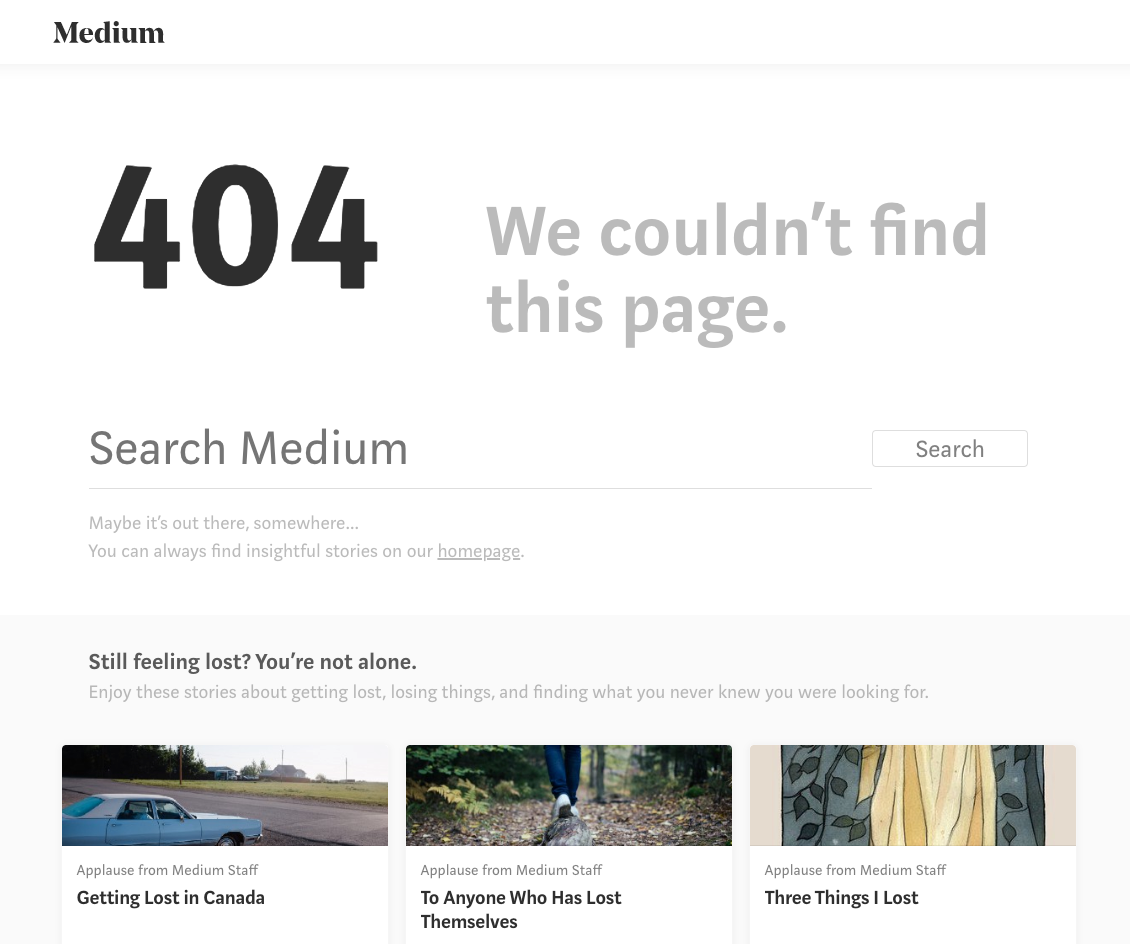
Medium did a great job creating their 404 page. They highlighted the search bar, making it clear that users should search their site to find what they’re looking for.
They also played on the idea of being ‘lost’ by linking to articles on getting lost and losing things. It’s a clever way to get people to click-through the page and get lost in their articles. See what we did there?
2. YouTube.com
Why This Works
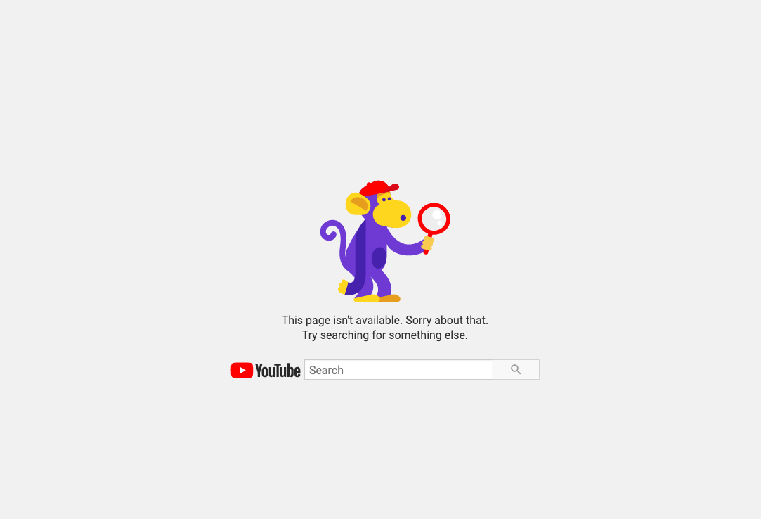
We love this 404 page example because it’s completely clutter free. YouTube removed anything that could possibly distract you and focuses solely on the search bar.
While only having a search bar on your 404 Page may not be the best solution for every site, who else could you trust to pull this off if not Google?
3. Lego.com
Why This Works
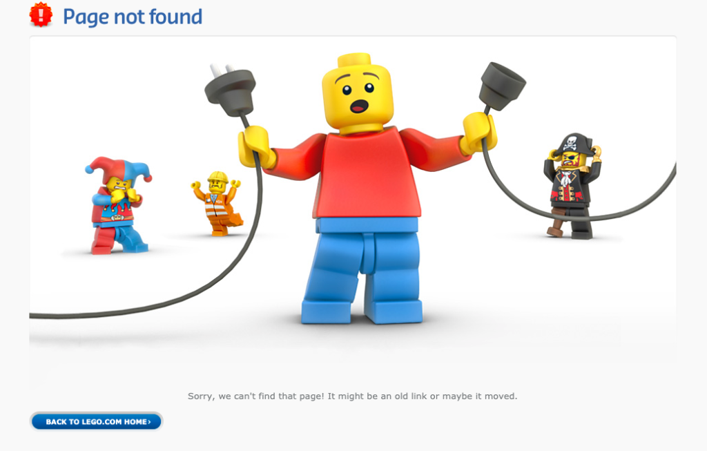
Lego’s 404 page couldn’t be more on-brand. The image is playful and the text tells the user what might have happened. They also include a link back to the homepage so users can continue browsing their site.
4. FirstWeFeast.com
Why This Works
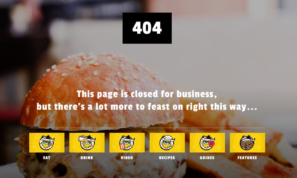
First We Feast is an online food magazine. Their 404 page is on-brand, using restaurant-inspired text to indicate the page couldn’t be found.
They also include links to various pages on their site to make it easy for the user to stay on site and view more content.
5.Disney.com
Why This Works
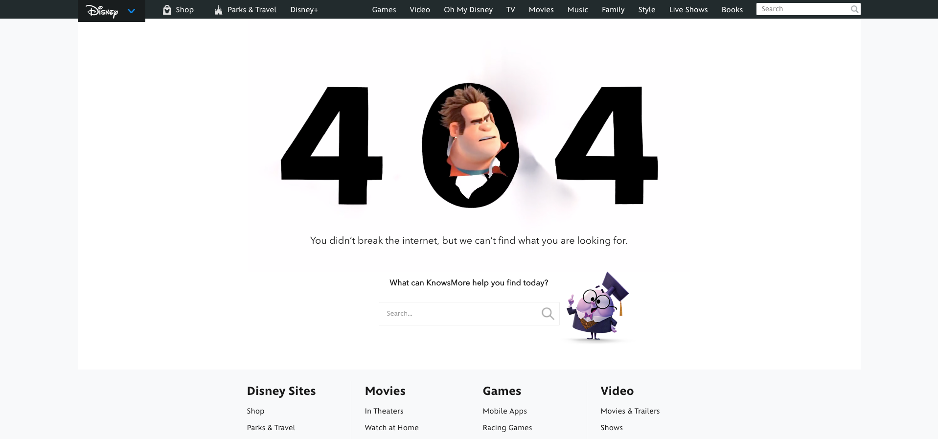
If you’re not familiar with Wreck it Ralph and Ralph Breaks the Internet, then Disney’s 404 page might not make sense to you. But for Disney lovers, the play on words and picture of Ralph is absolutely perfect.
Not only is the branding awesome, but they also include a search bar and footer links to make it easy for you to find what you need. (There’s actually 2 search bars – one in the top right too!)
Tips for Creating a Great 404 Page
Your 404 page should make it clear to the user where they are, but also help them in find a solution to the problem. Here are our tips for creating a great 404 page:
- Use humor – Don’t be afraid to have fun with this page. Humor can help deflect the frustration of not finding what you’re looking for and having to search again.
- Include links – Help users find what they want by including links to the most popular pages/blogs, social media accounts, or various categories on your website.
- Add a search bar – This gives visitors the flexibility to search again, without having to go back to Google.
In a perfect world, nobody would ever sees your 404 page (because you’re able to properly manage all of your links and redirects). However, even the biggest of sites have
broken links, making a 404 pages a necessity.
And one final tip from
Google:
“No matter how beautiful and useful your custom 404 page, you probably don’t want it to appear in Google search results. In order to prevent 404 pages from being indexed by Google and other search engines, make sure that your web server returns an actual 404 HTTP status code when a missing page is requested.”
Tags: Our Favorites • Web Design
Richard Horvath
Richard Horvath is the founder of TheeDigital, a Raleigh based award-winning web design and digital marketing agency. He is proud of his team and the results that they provide to their clients.
