You’re ready to rebuild or update your company’s website, and maybe you have some design ideas or you’ve seen some features you want to incorporate. Before you do anything, it’s important to make sure that the number one priority in your web design is the UX, or user experience. Good user experience is a huge factor in customer engagement, higher leads, and more sales.
So, what exactly is UX, and how should you apply it to your new website? To help you improve your website’s performance, our web design team is doing a deep dive into why UX is important. We’ll also provide you with some tips on making your website more user-friendly. We also have a free UX checklist to help you get to work mapping out your new site!

Understanding UX Design
First, UX stands for user experience and refers to how a user feels, thinks, and acts when interacting with a company’s website, services, and/or products. When you prioritize UX, you’re doing everything you can to provide a positive experience for visitors. This means ensuring visitors can easily navigate your website, find the information or products they are looking for, and engage comfortably, whether that means contacting you quickly or easily making a purchase.
When a website has great UX design, customers may not even notice it. Its design is intuitive and has clear navigation and concise direction, allowing your visitor to go exactly where they need to. In addition, the task that leads to your website’s goal (making a purchase, calling for a quote, etc) is clear and simple. When a website has poor UX design, that’s all that a user will notice. Instead of a seamless experience that leads to the goal of the website, they will end up annoyed, trying to figure out what to do or where to click as they scan through a poorly laid out or confusing design. (I’m sure everyone has been to a website like that. It’s not pleasant!)
UX for websites goes beyond creating an intuitive layout or making sure visitors know where and how to contact you. It’s about providing an experience that is specifically designed for your target audience or your ideal customer.
Why UX Design Is Essential to Your Business’s Success
At its core, website UX is a form of customer service. Effective UX design anticipates the website users’ pain points and provides a solution. Pinpointing problems that your website customer needs to solve creates value. How will the design of your website make it smooth and seamless for the user to reach their desired result? Losing a sale because of bad UX is more common than you think.
Unlike brick-and-mortar businesses where a customer is greeted personally, can ask questions face-to-face, and gets hands-on time with products, your website has to act as your sales representative. Your home page greets a visitor and your site’s layout and content should answer any questions your customer has while providing instruction as to what the next step is, all while setting a tone reflective of your business.
When a visitor has a good experience on your website, there is a greater chance that that visitor will become a loyal customer. (On the other hand, if they can’t find anything or don’t like what they see, they’ll move on to your competition.)
For example, if you are a lawyer and are building or updating your website, you’ll want to make it very clear what kind of law you practice, explain why you’re the right option for the visitor, and make it easy to set up a consultation. If a prospective client visits your website and they don’t know if you’re a divorce lawyer or criminal defense attorney, they don’t know anything about you, or they can’t easily schedule an appointment, they’ll leave your site and find another option. Similarly, if your website’s design is clunky, confusing, or unattractive, the visitor will leave before learning anything about your law firm.
5 Steps to Creating Effective UX Design for Websites
Jonathan Maxwell, UX designer at TheeDigital, explains UX for websites like this, “UX is a massive amount of work that should happen well before the site is started, during the site [development], and after the site [launches].” This means that you need to make sure your site appeals to your target audience while providing the intuitive experience we discussed above. To help you achieve this, we’re sharing some guidelines to follow while designing or updating your website.
User Personas
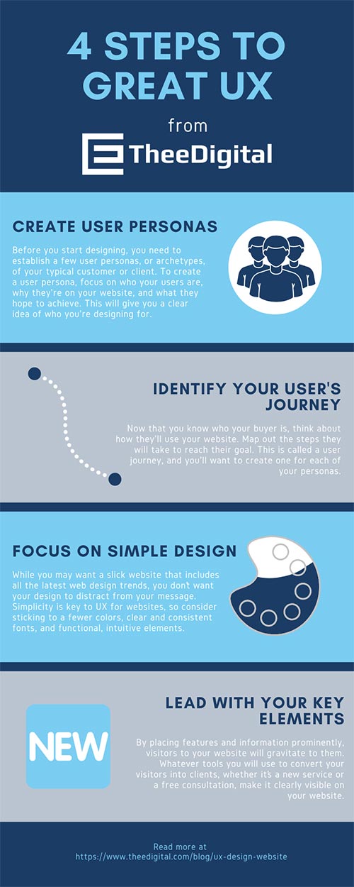
Before you start working on user experience, you need to understand who you are designing for. The first step in understanding your customers is establishing two or three user personas.
User personas area archetypes of your typical customers or clients. To create a user persona, you’ll want to focus on who your users are, why are they on your website, and what they hope to achieve. What problem do they have that you’re going to solve?
For example, if you own an HVAC repair business, think of a few of your “average” or common leads. Perhaps one is a landlord who manages an apartment complex. This client is focused on getting quick and affordable service.
Another user persona might be a 35-year-old female homeowner whose air conditioning unit isn’t working properly, but she doesn’t know how to fix it. Her main priority is fast service that fixes the problem, no questions asked.
Dig into your customer records and see if you can find any trends in your average client or customer. Use this information to form your user personas.
User Journeys
Now that you know who your buyer is, think about how they’ll use your website. Map out the steps they will take to reach their goal. This is called a user journey, and for each of your personas, you’ll want to follow these steps:
- Create a likely scenario that your persona is facing – what are their pain points, what are their goals, and what do they want to achieve by coming to your website? The landlord in the example above might have gotten a call from a tenant at 10 p.m. to fix a broken AC unit. He needs to know if you provide emergency service, what your rates are, and a fast way to contact you. His goal is to connect with a technician who can get to the tenant’s house ASAP.
- Create a scenario map for each persona – as soon as the visitor lands on your website, where will he or she go in order to achieve their goal? For the HVAC website, using the landlord persona, his map would probably be home page -> look at services for emergency repairs -> contact. The shorter this journey is, the better.
- Assign an idea to each action to plan out navigations – Under each step in the map, think about how will your website help achieve that action. In our example, we would put home page -> service page to include section on emergencies with a link to the emergency contact line.
Focus on Simple Design
After you understand how the navigation should flow, you can begin considering the actual design of your website. Remember to consider your user personas, though – you’re going to be designing with them in mind!
While you may want a slick website that includes all the latest web design trends, you don’t want your design to distract from your message. Simplicity is key to UX for websites, so consider these general guidelines:
- Fewer colors – You don’t need a rainbow on your website. Stick to using between two and four colors on your website’s design.
- Clear typeface – Your customers need to be able to read your content easily, even on mobile devices, so make sure you are using fonts that are easy to read. And resist the temptation to use a lot of fonts. Just two or three fonts are plenty.
- Functional elements – Any videos, animations, graphics, or other elements should all work to improve the user’s experience or provide valuable information. Extra graphics that don’t serve a purpose can clutter your design and distract your user.
Lead With Your Key Elements
When you’re designing your website UX, you want to lead visitors to conversion without being pushy. The idea is that you’re creating a natural path to the end result, whatever the goal of your website is. By placing features and information prominently and by drawing attention to those elements, visitors to your website will gravitate to them. Whatever tools you will use to convert your visitors into clients, whether it’s a promotion you’re running, a new service you’re offering, or a free consultation, you want that to be clearly visible on your website with a simple link to direct your visitors to that action.
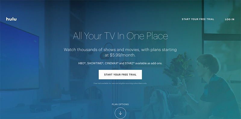
Here on Hulu’s home page, you’ll see that it’s very clear that they are leading with the free trial to get new customers to sign up. Lower on the page, they have basic outlines of their plans and original programming, but their number one element is front and center.
When you’re focusing on UX, there should never be any question as to what the next step is for your visitors. That’s why a call to action is essential on every page of your website. If you want your visitors to schedule a consultation, make sure they know that is the next step by laying it out in your content or in a graphic.
UX Checklist
Overall, you want your visitors to have a great experience at your website, which means, for them, your site is fast, clear, and easy to use. This means you’ll want to make sure your website includes these features:
- Contact information is made highly visible and includes links to make calls fast
- Call-to-action makes it clear how users can get information or opt-in
- Search tool makes it easy for users to locate information on the site
- Responsive web design ensures excellent UX from smartphones, tablets, and laptops
- Quick page loading speed
Ensure Amazing UX Design with TheeDigital
Tags: Web Design
