Rapid advancements in technology have significantly impacted website design trends for 2025. When examining 2025 web design trends, what was once cutting-edge in 2024 has quickly become outdated for 2025. The last thing you want when visitors land on your site is to lose potential conversions due to an outdated appearance or non-compliance with web standards.
Thankfully, our web design agency stays up to date with the latest website design trends, developing highly functional, user-friendly websites that perform exceptionally and boast an impressive aesthetic. We’d like to present some of the most recent breakthroughs, digital technology trends, standards, and projections for 2025 and beyond.
Web Design Trends 2025
Certain aspects of web design trends will always remain crucial, such as user-friendly navigation, data security, and swift loading times. However, incorporating these emerging features will keep your site modern and visible. Helping to maintain your site’s cutting-edge status and search engine prominence in search rankings for 2025.
- 1Color Trends
- 2Fonts
- 3Anti-design and A Human Touch
- 4Sustainable Web Design
- 5Experimental Navigation
- 6Big Blocks and Vivid Contrast
- 7Brutalism
- 8Motion Design
- 9Scrolling Animations
- 10Micro-Interactions
- 11Micro-Animations
- 12Emphasize Negative Space
- 13Interactive 3D Models And Content
- 14Gamified Design
- 15Organic Shapes
- 16Smart Video
- 17Text-Only Hero Images
- 18Custom Illustrations
- 19Dark Mode
- 20Data Visualization
- 21Blending Photos With Graphical Elements
- 22Progressive Lead Nurturing Forms Integrated With Your CRM Tool
- 23Chatbots More Like “Chatbuds”
- 24Voice-Activated Interface
- 25Virtual Reality
1. Color Trends
Web design color trends for 2025 are embracing a significant shift toward digital comfort. Even though recent years focused on attention-grabbing saturated hues, designers are now moving toward more soothing and nurturing color palettes.
These thoughtfully chosen colors create welcoming digital spaces that reduce visual fatigue. By no means are design trends getting dull, designers are using rich warm tones, to create interest and guide users naturally. At the same time, multi-tonal color schemes are also gaining popularity, offering both sophistication and warmth. The Pantone color of 2025 is Mocha Mousse.
2. Bold Expressive Fonts
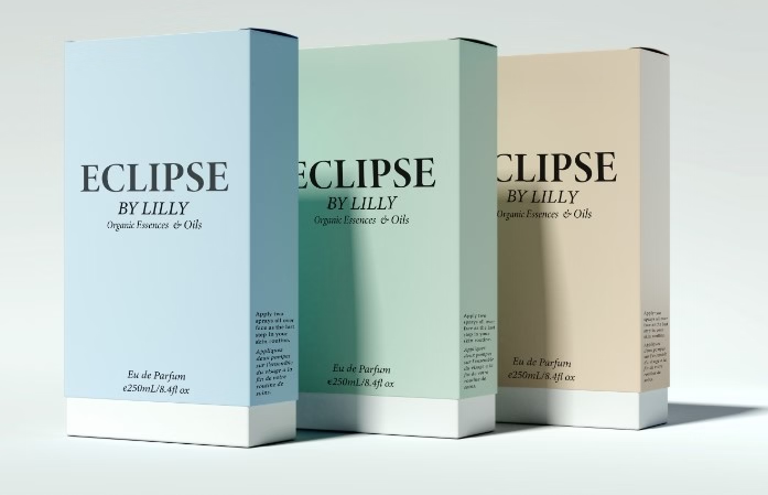
Variable fonts offer flexible styling while improving load times. Meanwhile, serif fonts are back in digital design, adding warmth to headlines and CTAs
Another key trend is maximalist typography, where oversized and layered text is used to create visual impact. Additionally, designers are embracing high-contrast pairings between serif and sans-serif fonts, along with playful, custom typefaces that evoke personality. These trends aim to make typography not only functional but also an integral element of storytelling and brand identity.
3. Anti-Design and A Human Touch—Designers Embrace Imperfection
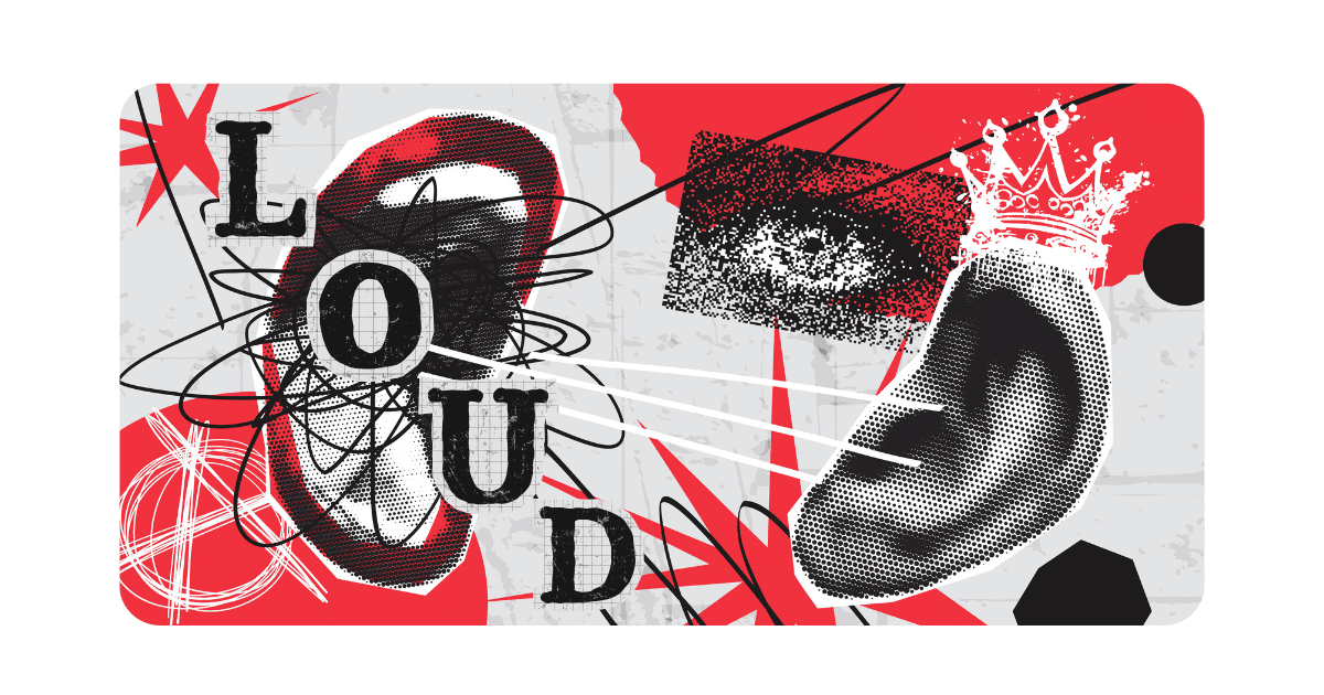
Anti-design – From cluttercore to experimental typography, you have to push those boundaries! Asymmetrical layouts and extreme unbalance? Do it. Overlapping artwork and clashing colors? Hard yes.
The anti-design 2025 web design trend leans towards breaking traditional rules and embracing asymmetrical layouts or unbalance. It challenges conventional design rules. By all means, it’s not a design choice for everyone, it has been up-and-coming lately and taking social media by storm.
The perfect, polished look of websites is shifting to a more authentic, human feel in 2025.
These intentional imperfections strengthen user connections, demonstrating that websites don’t need conventional perfection to engage users effectively.
4. Sustainable Web Design 2.0
In 2025, web sustainability will evolve beyond basic optimization focusing on creating environmentally friendly websites. As designers and developers take a more holistic approach to reducing digital carbon footprints. This isn’t just about faster loading times anymore – it’s about conscious design choices that consider environmental impact at every level.
Sustainability is now a key factor in web development, from optimizing media and coding for efficiency to selecting eco-friendly hosting. By prioritizing streamlined code, accessibility, and eco-friendly hosting options, Sustainable Web Design helps reduce carbon emissions associated with the internet.
Additionally, these practices not only benefit the environment but also result in faster, more efficient websites that users love to interact with. This 2025 web design trend represents a perfect alignment of user experience, performance, and environmental responsibility.
5. Experimental Navigation
Experimental navigation engages users through unique interactions, unexpected layouts, and novel experiences, breaking away from traditional static menus and dropdowns.
These designs feature immersive scrolling, engaging animations, 3D transitions, spatial interfaces, or non-linear exploration paths.
Commonly found on creative or portfolio sites, these navigation styles surprise and captivate visitors, encouraging longer site engagement and unique content interaction compared to standard navigation.
Also, experimental navigation can showcase brand personality, creating a lasting impression, but it must remain user-friendly and intuitive to prevent frustration and usability issues.
6. Big Blocks with Vivid Contrast
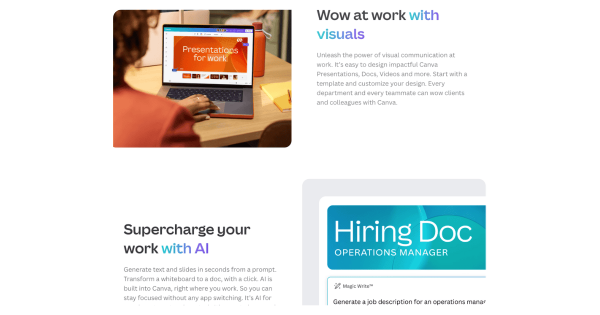
Web design trends in 2025 are embracing the power of bold, block-based layouts paired with vibrant color contrasts, as perfectly exemplified by Canva’s website.
What makes this trend particularly effective is how it balances visual impact with functionality. Contrasting color blocks create visual interest and natural navigation points for users.
Companies like Canva demonstrate how this style can showcase different product features or service offerings while maintaining a playful, modern aesthetic.
But the key is in the thoughtful use of color psychology and spatial relationships – each block acts as its own micro-environment while contributing to the larger story of the brand. This design approach proves especially effective for creative platforms, SaaS companies, and brands targeting design-conscious audiences.
7. Brutalist Design

2025 web design trends are swinging dramatically, with a notable resurgence of brutalist principles for the modern web. Characterized with bold typography, simple layouts, and unpolished elements, this trend pushes back against years of polished, template-driven design.
Inspired by iconic designs like RAW magazine and punk rock aesthetics, modern brutalism favors raw, honest presentation, stripping away unnecessary decorative elements.
Undeniably what makes this iteration of brutalism particularly interesting is its sophisticated approach to simplicity. Designers are embracing monochrome color schemes, grid-based layouts, and minimal imagery not as limitations, but as tools for creating powerful visual impact.
2025’s brutalist revival isn’t about being intentionally difficult or aggressive – it’s about authenticity and directness in communication. This appeals to brands seeking differentiation in a homogenized digital landscape, providing a refreshing departure from the highly polished aesthetics of recent years.
The result is websites that reject current design conventions, feel more human, honest, and paradoxically modern.
8. Motion Design
After years of excessive animation and 3D elements dominating the web design trends, 2025 marks a shift toward more intentional and refined motion design.
Designers are embracing a “less is more” philosophy, using purposeful animations and strategic 3D elements rather than as default features.
This refined approach enhances site performance, reduces cognitive load, and makes interactions more meaningful when they occur. Also, this results in websites that feel more sophisticated and user-focused, where motion enhances rather than distracts from the core user experience.
9. Scrolling Animations
Scrolling animations add a dynamic, engaging element to a website’s user experience, as different animations and effects are triggered in response to a user’s scrolling actions.
This can involve elements fading in or out, changing color, or moving into place, creating a visually captivating experience that encourages users to continue exploring the site.
Notice in the example below on The Cookery School’s website, the small circle of text rotates as you scroll down the page.
10. Micro-Interactions
On a website, micro-interactions are small animations that offer subtle feedback to users.
One of the most commonly used micro-interactions is seeing a link change colors when a user mouses over it.
With the focus on micro-interactions, that same experience might be given more attention to stand out.
Imagine a gradient slowly shifting hues as you scroll down a page, or a pop of color exploding from your mouse after you click an element.
These are prime examples of elevated micro-interactions that you’ll see more often.
11. Micro-Animations
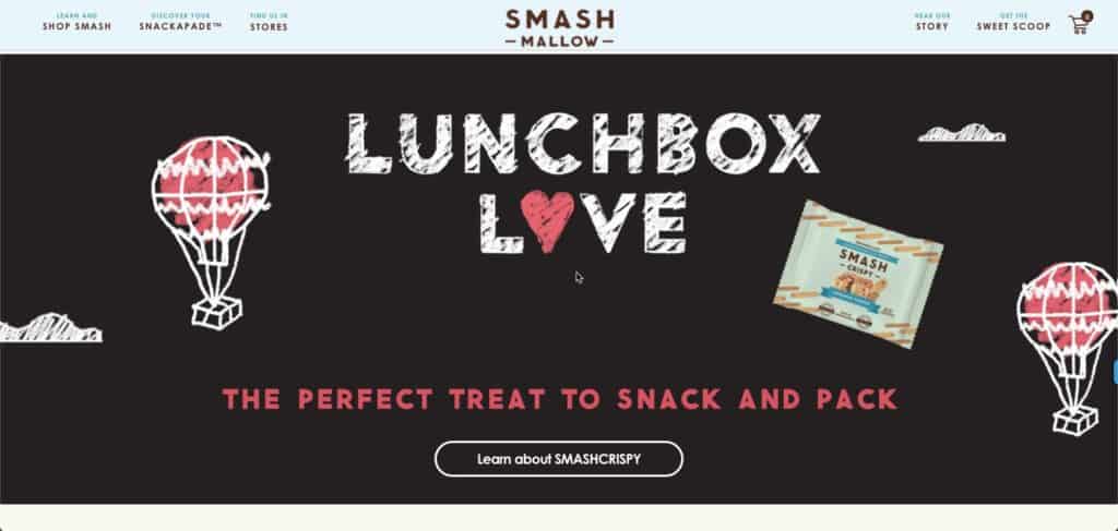
As you might have guessed from the name, micro animations are small animations. But in this case, small doesn’t mean insignificant. Micro animations are extremely helpful when it comes to guiding users through their interactions with your website. They can also add an element of playfulness to your site like Smashmallow did with the micro animations in their hero image.
Micro animations have been popular for several years, but in 2025, it’s all about using them with intention and restraint. As our UI/production designer explained, we’re thinking about how things move more naturally, whether they’re on a curve or wheel instead of on a flat plane.
In 2025, ecommerce sites, especially in fashion and retail, use sophisticated micro animations to enhance UX and dynamically showcase products. These context-aware animations intelligently respond to user behavior while maintaining the subtle, purposeful nature that makes micro animations so effective.
12. Emphasize Negative Space
Designing a website that emphasizes negative space involves carefully balancing content with empty or “white” areas to create a clean, uncluttered layout.
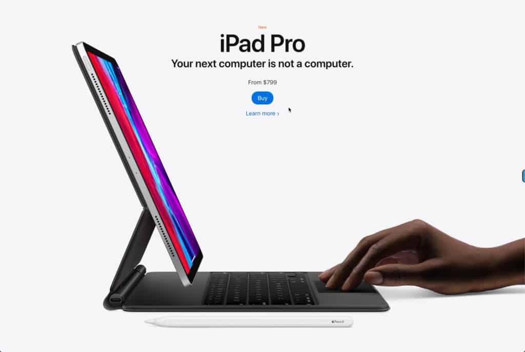
Simplicity and minimalism are key, giving text, images, and buttons room to breathe, enhancing readability and focus. Use margins, padding, and line spacing to create visual separation between sections without overwhelming the user. Prioritize hierarchy through typography, using different font sizes and weights to naturally guide the visitor’s eye. By reducing distractions and clutter, negative space helps create a more intuitive and aesthetically pleasing user experience. Best in class for this has almost always been, and continues to be Apple.com!
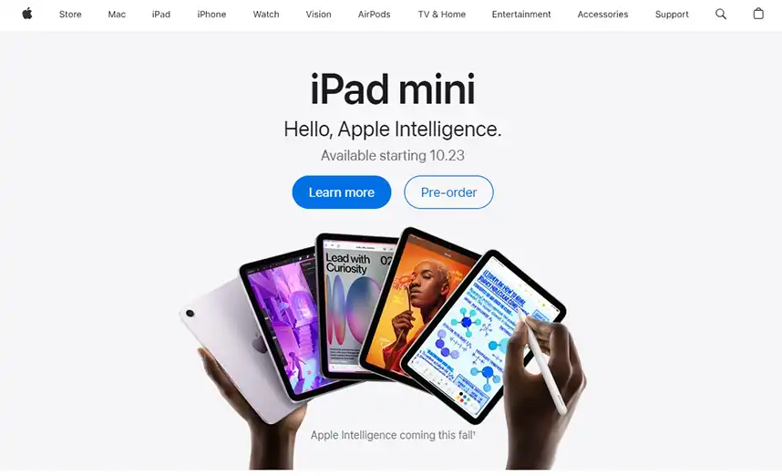
13. Interactive 3D Models And Content
Thanks to maturing web technology and web designers wanting to stand out from the average webpage, 3D elements that users can interact with were commonly used in 2024.
The results can be breathtaking – like the use of interactive 3D content on the Campo Alle Comete website.
3D model animations can also be used for products to offer a more true-to-life representation, allowing site visitors to see every detail from every angle, as if they were viewing the product in person. This enhances the online shopping experience, increasing customer confidence, and potentially improving conversion rates. While motion and 3D elements remain powerful tools in web design, 2025 web design trends signals a shift toward more thoughtful implementation
14. Gamified Design
Gamification is adding game-like elements to your website such as points, rewards, and challenges to entice the user to spend more time on your site and potentially provide information about themselves.
Adding interactive sections to your website is a great way to provide value for visitors, get them to engage with your website, and learn more about them.
Suppose you were a realtor and added a mortgage calculator to your website. You’re offering value to your visitors while also learning more about them based on the data being inputted into your calculator.
Examples of interactive marketing include:
- Assessments like quizzes
- Polls and surveys
- Calculators
- Contests
Want to Improve Your Website Performance?
We can provide a personalized website assesment and one on one consultation.
15. Organic Shapes
While organic shapes have been a staple in web design since 2020, their application in 2025 web design trends has matured into something more sophisticated and purposeful. Now we see designers strategically integrate fluid shapes into user interfaces and brand storytelling, beyond mere decoration.
These natural, asymmetrical forms are being combined with interactive elements and micro-animations to create more intuitive navigation patterns and guide user journeys. Companies are favoring intentional, brand-aligned organic shapes over random blobs to enhance UX and maintain visual appeal.
As seen on Microsoft’s Surface pages, where fluid forms blend with product imagery and create natural scroll paths through content.
16. Smart Video
Video has long been touted as a must-have for websites. People love videos because they are engaging and some users prefer to watch a video than read text. Videos can also build trust and drive conversions.
While video is great, it needs to be thought out. That’s what smart video is about: video with a purpose and meaning. Gone are the days of embedding a YouTube video on your site just to have one. One well-thought-out, high-quality video is better than a dozen haphazardly assembled ones.
We recommend creating informative videos that directly answer questions that you hear often from your prospects and clients. This will make your website an valuable resource and also help to establish your brand as an authority in your industry.
17. Text-Only Hero Images
Newspapers always put their most eye-catching, important information “above the fold” to increase sales. The website equivalent of this is at the top of a page and is called the “hero section.” A current trend to catch internet users’ attention who are bombarded by different web pages every day is removing the typical background image in the hero section and replacing it with eye-catching typography. A bold, unique font could be just the thing to get a user’s attention quickly.
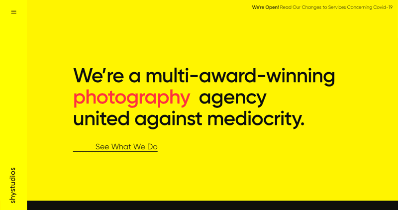
18. Custom Illustrations
Stock images are out, custom graphics are in! Illustrations help to bring your company’s image to life. Custom illustrations are expected to lead the way as cookie-cutter stock graphics take a backseat.
19. Dark Mode
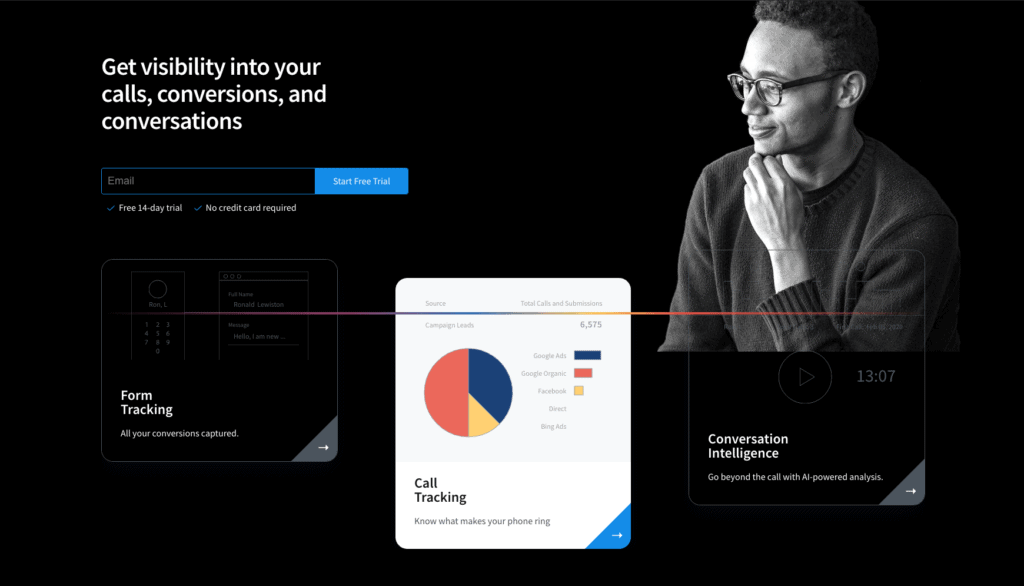
Dark mode web designs serve a couple of different functions. On the practical end, they help reduce eye strain, a concern for many as we are spending more and more time looking at screens. On the aesthetic end, dark mode easily creates an ultra-modern look for your website while giving you the ability to highlight other design elements just by darkening the elements that surround it.
20. Data Visualization
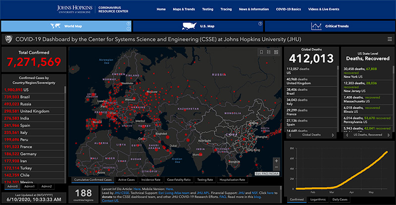
Communicating data in an engaging way is a struggle. But the struggle is worth it because using data visualization takes advantage of the fact that humans are visual creatures, and still conveys the message you need to get across.
Data visualization creates images out of your data that engage your reader and makes them want to learn more about your brand.
Infographics and graphs are some of the most popular ways to bring data to life.
21. Blending Photos with Graphical Elements
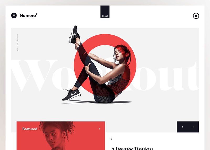
You might have noticed overlapping graphics on images in your social media feed. This mixing technique brings a level of creativity and fun to a typical image.
The trend is also catching on with websites. Mixing photography with graphics can reinforce your company branding and keep website visitors engaged with your content.
22. Progressive Lead Nurturing Forms Integrated with Your CRM Tool
Online lead generation forms are one of the most important elements of a marketing website. We want to get to know a lot about our website visitors, but we can’t ask too many questions at any particular time. We place progressive/dynamic contact forms on the landing pages and display fields according to the lead’s journey.
Ideally, we don’t want to display too many fields in a form, but we can always adjust the form fields according to the data that we already know about our leads. We might ask the name, company, and email address at the first conversion and then ask for the phone number, title, company size, and company revenue fields at the next conversion opportunity.
Your CRM, like HubSpot, can store the information of your leads. By integrating it with your website, the CRM can recognize the lead when they come back to our websites and display form fields on the landing pages that we don’t know about the contact.
23. Chatbots More Like “Chatbuds”
Chatbots are another feature that has been popular for a few years and will continue to be relevant in 2024. As artificial intelligence and machine learning continue to get more sophisticated, we expect to see chatbots become the norm for simple customer service requests and “personal shopping.”
For example, if a customer visits your website, looking for phone support and the chatbot knows they have an available free phone upgrade. The chatbot can let them know about the upgrade. This can lead to a positive experience for the customer and save the business the customer support cost associated with talking to a live person.
Concerned about not having enough staff to manage a web chat? Utilize tools that can forward your web chats to your mobile phone, enabling you to engage with customers while on the move.

24. Voice-Activated Interface
The way we access information is changing – instead of typing into Google, we now ask a question or make a demand. This means web design is adjusting to keep up with the prevalence of voice chatbots and virtual assistants.
While a voice-activated interface isn’t commonplace for most websites, this emerging trend isn’t going anywhere in the foreseeable future.
We can expect to see more and more websites integrating voice search as an option to traditional text search.
25. Virtual Reality
VR experiences on websites will continue to increase over the coming years. Major retailers like Nike are using virtual try-ons for shoes, while Sephora’s virtual makeup testing has revolutionized online beauty shopping. Home improvement giants Home Depot and Lowe’s now offer immersive room design tools, letting customers visualize entire renovation projects.
These immersive features aren’t just novelties anymore—they’re essential shopping tools. VR can be a powerful tool for a website to serve useful, meaningful content to a visitor in a way that helps them make buying decisions.
From virtual clothing try-ons to realistic product demonstrations, VR/AR elements help users make confident buying decisions without leaving their homes. The key difference in 2025 is how these features have become more accessible and performance-friendly.

Previous Trends That Have Become Standard or Common
1. White Space
The use of white space is about giving content room to breathe, not trying to cram the most information possible on the screen. The experience is more relaxing for your website visitors, the content stands out better, and readability is improved.
White space is just the term for the spacing we give between elements. It does not have to be white, as long as the area is empty. This is why it’s also known as “negative space.”
A clear indication of an outdated website is the presence of an overwhelming amount of text, often referred to as a “wall of words” and no white space. In contemporary web design, the focus is on creating a balanced and visually appealing layout that combines compelling visuals, concise text, and user-friendly navigation. The concept of a “wall of words” is considered obsolete, as it tends to overwhelm visitors and may limit engagement rates.
2. Parallax Scrolling
Parallax scrolling is a widely embraced web effect that adds dynamism to specific sections of a webpage. It’s typically employed in full-width applications, accompanied by images, videos, or textured visuals that contribute depth to a page. As users scroll past the media, the scrolling action creates an illusion of the media being positioned behind adjacent sections, making the content more engaging.
3. Gradients
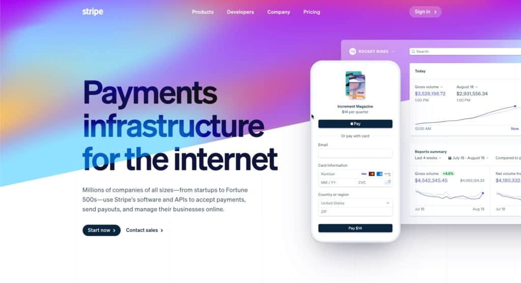
Gradients are a long-time trend that has evolved from subtle color overlays to eye-catching backgrounds.
They can be used to add depth, serve as a striking background, or subtly to add texture to an illustration. We increasingly see it used in bigger and bolder typography.
This trend has staying power. We’re excited to see the continual evolution of its use on websites.
4. Thumb-Friendly Mobile Navigation
Responsive design isn’t enough anymore. Your website should work well and be user-friendly on all mobile devices – regardless of the size! But in 2025, web design will continue to be focused on creating websites that are thumb-friendly.
What exactly is “thumb-friendly”?
We’re talking about the way we use our phones. If you’re reading this on your phone right now, look at how you’re holding it. Your fingers are probably wrapped around the back of your phone (or around a phone grip), leaving your thumb to do all the work. You probably look like this.
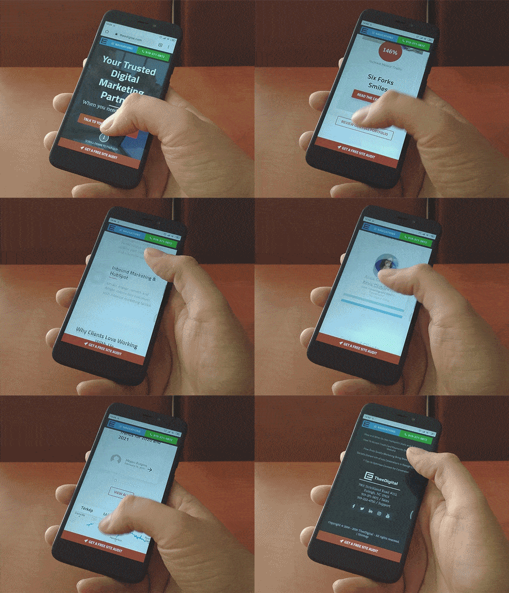
Spooky, huh?
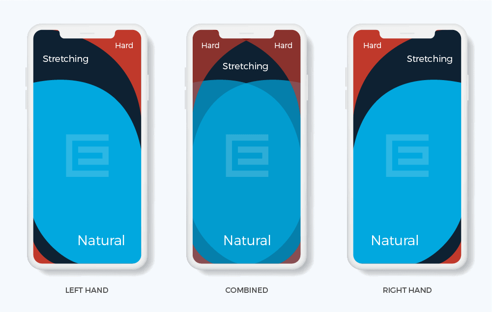
Not really. That’s how most of us use our smartphones, and that’s why thumb-friendly navigation is essential. Putting the navigation bar, menu, and even contact buttons in the space your thumb can reach (the center of the screen) makes your site more comfortable to use and improves your UX tenfold.
Here is a great graph showing the thumb-friendly areas of a phone screen:
5. Website Load Time and Page Speed
One of the most critical web design standards revolves around lightning-fast load times. Prompt loading speeds have been vital components of user experience (UX) and search engine optimization (SEO) for years and continue to be a top priority for high-ranking, high-converting websites.
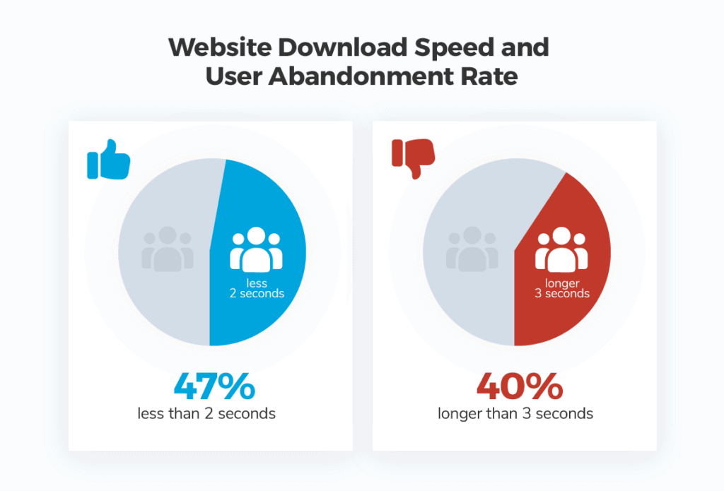
Research indicates that over half of internet users expect websites to load quickly, within two seconds of clicking a link. If your site takes longer than three seconds to load, visitors are likely to abandon it and probably never return. Website performance directly affects a company’s revenue. For instance, Pinterest managed to reduce perceived waiting times by 40%, resulting in a 15% increase in search engine traffic and user registrations.
At TheeDigital, our mantra is “conversion, conversion, conversions.” We closely monitor website loading times to ensure a seamless user experience.
6. Intelligent Content Loading Techniques
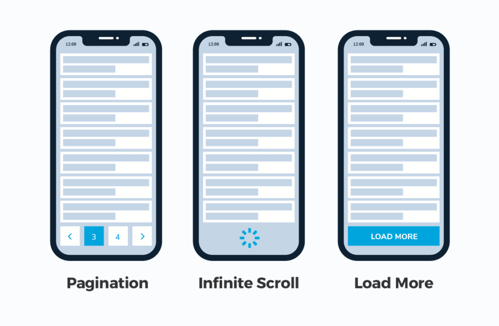
A large number of websites today are laden with resource-intensive elements and external integrations, resulting in slower loading times. However, there are several methods available to create smarter websites that load only the necessary content for the user. Techniques such as lazy loading and infinite scrolling have been employed by major social networks for years and are particularly popular for lengthy single-page websites.
Adopting one or more of these technological approaches can provide a competitive edge and enhance the overall user experience, thereby improving conversion rates and search rankings. Lazy loading, for instance, ensures that web browsers like Google Chrome, Safari, and Firefox download only the visible content on the screen, conserving server resources and reducing loading times for unseen content.
Since many users never reach the bottom of a webpage, it makes more sense to load content as they scroll down, approaching the lower sections of the page.
7. Geolocation & Browser-Based Content
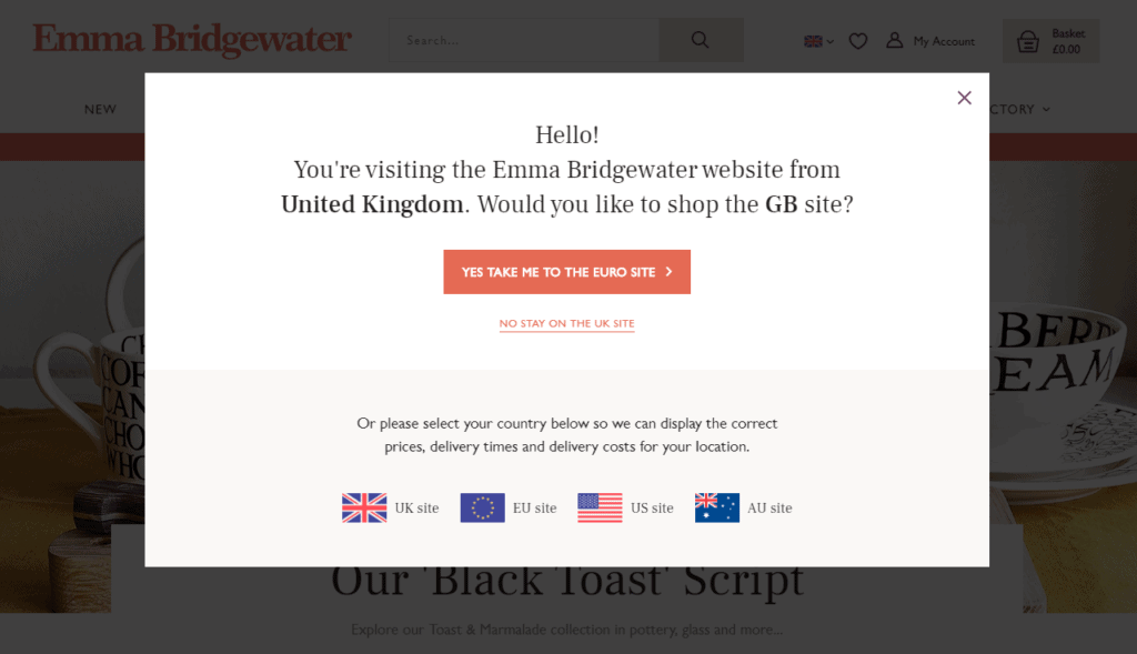
You may have noticed that the content on certain websites changes when revisited after a short period or accessed from a different device or browser. Advanced websites leverage browsing history and location data to deliver dynamic, personalized content rather than generic information intended for a broader audience.
Customized content for repeat visitors can result in higher conversion rates. This is evident in search engines like Google, where location-based results are displayed for queries. For instance, people searching for nearby restaurants in Raleigh, North Carolina, will see different results than users in other locations.
An efficient directory website can also take user preferences into account, such as prioritizing Italian restaurants in search results for users who have previously reviewed or saved them. Personalized content is particularly crucial for e-commerce websites, where displaying recently viewed, saved, or liked products and highlighting abandoned cart items can lead to increased conversions.
As users increasingly expect personalized website content, it will become a more significant factor in achieving a successful online presence. What makes 2025’s approach distinctive is its subtlety and intelligence. Rather than obvious location-based changes, websites now seamlessly adapt their entire experience—from content delivery to interface design—creating naturally personalized journeys that feel intuitive rather than intrusive. As users increasingly expect this level of customization, it’s becoming a crucial factor in maintaining competitive advantage and driving engagement.
8. Accessibility and Availability
Inclusivity and accessibility are more than a trend, but there is a growing need for web design to factor in the needs of people with disabilities. In 2025, accessibility has evolved beyond basic compliance to become a fundamental aspect of thoughtful web design. Having a site that every visitor can navigate and interact with is more than just part of good customer service and providing an excellent experience. It can increase conversion, boost your SEO, and help you reach a bigger audience.
Elements that improve accessibility include:
- Creating strong color contrast between text and backgrounds;
- Adding focus indicators, such as the rectangular outline that shows up around links when using keyboard navigation;
- Using labels and instructions with form fields rather than low-context placeholder text;
- Using functional alt tags for images (which also boosts SEO!)
Modern accessibility focuses on a holistic approach where design fundamentals and user needs intersect. Designers are moving beyond basic requirements to create experiences that are inherently accessible through thoughtful typography, strategic use of color psychology, and intentional content hierarchy. This approach naturally aligns with current trends toward human-centric design and authenticity.
9. Grid System
Are grid systems going away in 2025? While 2025’s web design trends like anti-design and brutalism might suggest a departure from structured layouts, grid systems remain an essential foundation of web design. What’s changing is how designers use them—grids are becoming more fluid and adaptable, supporting both traditional and experimental designs.
Even in layouts featuring big blocks with vivid contrasts or brutalist elements, the grid provides structure that ensures responsive behavior across all devices. Far from disappearing, grid systems in 2025 are simply evolving to enable more creative freedom while maintaining essential functionality.
Examples of Grids in Use: Shrine from Google’s Material Studies
10. Full-Page Headers
While full-page headers remain relevant in 2025 web design trends, their implementation has evolved significantly from the static hero sections of previous years. Today’s full-page headers combine elements of experimental navigation and motion design to create more dynamic, interactive experiences. Rather than simply placing important text or call-to-action buttons on the left with graphics on the right, designers are now using these spaces to introduce brand storytelling through thoughtful animations and intentional user interactions.
However, the key to successful full-page headers in 2025 lies in their restraint. In line with the broader trend toward sustainable web design and reduced motion, these headers must balance impact with efficiency.
11. Full Height Homepage Hero
Like a giant billboard, making your homepage hero section full-height can focus your users’ attention and serve as distraction-free messaging.
Think of full-screen hero sections as an opportunity for great storytelling. Just keep in mind that images will crop differently based on browser dimensions.
You should use an image that will accommodate the design accordingly. Concerned about your content not being “above the fold? The significance of having optimized content within the immediate viewport has diminished, given that most users are accustomed to scrolling down for more information.
The Latest Web Design Trends and Standards for 2025 in Three Words: Authentic, Sustainable, and Bold
As we look at 2025 web design trends, we’re seeing a shift toward authenticity through brutalist elements, thoughtful motion design, and intentional imperfections. The focus is on creating websites that not only look striking with their vivid contrasts and experimental navigation but also consider environmental impact through sustainable practices. These trends reflect a broader movement away from cookie-cutter designs toward more authentic, purposeful digital experiences. Updating your website’s design isn’t just about aesthetics—it’s about creating meaningful connections with your audience while staying current with evolving user expectations.
Updating your website’s design can positively impact your brand and revenue. If you want a modern and user-friendly website, contact our team today. Call 919-635-5575 or schedule a consultation today!
Tags: Our Favorites • Web Design
