How Are Landing Pages Different Than Other Webpages?
There are two main differences that separate landing pages from other kinds of webpages. The first is that a landing page is strategically designed to achieve one specific goal. The goal could be to sign up for a newsletter, to schedule a consultation, to download an app, to purchase a product, or any number of other desired actions. We call this desired action a “conversion,” since your visitor has converted from an anonymous user into a lead or a customer. The second key difference is that we are usually in full control of how our visitors reached our landing page. For instance, with a Google PPC campaign, we know that the visitor started their journey with a specific keyword search. We know what ads and ad copy they saw, and we know that they clicked on our paid ad in order to reach our landing page. We should, in fact, ensure there is no other possible way to discover our landing page. We don’t want stragglers wandering in from other marketing channels. This will only muddy our statistics and hinder our ability to measure the effectiveness of our strategy. Like any scientific experiment, we want to eliminate the variables. Landing pages should be set to no-index, so they can’t be found via organic search, and there should be no links pointing to them from your main website. With an email marketing campaign, social media ad, or display network ad, we have a similar level of control over our visitor’s journey. We can target these people through the criteria of our choosing, we can show them a specific offer, and we can know what they clicked on to get to our landing page.Recognizing Your Visitors’ Intent
We don’t know as much about your other website visitors, because we did not have the privilege of precisely choreographing the discovery phase of their journey. They could have heard a radio ad, followed a link in another article, or got a recommendation from a friend. They could have found our site through organic search, but who knows what keywords they searched? It’s a mystery. Sure, in analytics, we can see the channel that led them to our site, but we still have a very murky picture of their initial intent. Conversely, when we control the entire journey, we have a much clearer picture of our visitors’ intents and interests from the very beginning. This is immensely powerful. If you want to quantify this power, consider this: With a well-executed paid search campaign and landing page strategy, it is not uncommon to achieve conversion rates over 20%. Meanwhile, on the same site, it would not be uncommon for all other visitors to convert at a 1% – 2% rate. See how the right PPC strategy helped increase conversions and boost ad clicks over 370% for a regional trailer company.Landing Page Philosophy 101
Now that we have established what makes landing pages unique, let’s talk about how we can make them successful. This is not a design article. There will be no speak of what color buttons to use or where you should place your contact forms. This one’s about psychology, so take a seat in your chaise longue, because we are going to talk about feelings. Humans are emotional beings, and emotions play a major role in our decision-making process. Your visitor came to your page because they were feeling a certain way. Whether they performed a Google search, clicked an ad in their Facebook feed, or followed a link in a promotional email, their feelings guided the decision to click. That said, the job of your landing page is to make your visitor feel better. If the solution you offer assuages the core feelings that brought your visitor to the page, you have a good chance at converting them. Let’s consider this poor fellow: What does this gentleman need more than anything else, at this exact moment in time?
If you answered pants, you are incorrect.
If you handed this fellow a pair of pants, he’d still have to get dressed in front of hundreds of strangers. He might still get arrested, end up on the news, ruin his marriage, and live the rest of his life in solitude.
Pants aren’t the solution that addresses his true emotional crisis. He is feeling embarrassed, vulnerable, and scared. He needs an escape plan to cure his current ailment, not a pair of Dockers.
Keeping the Decision Binary
Perhaps not everyone who visits your landing page is in quite as much of a rush as our pantless protagonist, but rest assured they are not going to stick around for long. Maybe a decade ago surfing the web meant sitting down in a comfortable chair, pouring yourself a Pinot Grigio, firing up the old desktop machine, and settling in for a good, thorough search. That’s not how it works anymore. Today people conduct searches in whatever spare seconds their busy lives afford them. They search while eating lunch, standing in line at the grocery store, or God forbid, barreling down the highway at 70 miles an hour. If you look at your analytics report, you might find that your website visitors are there for an average of a minute and a half. That’s not a lot of time to make a decision. You can’t go on a round trip of the features page, the pricing page, the about us page, the testimonials page, and back in 90 seconds. It takes longer than 90 seconds to pick out a coffee at Starbucks, and you already know the menu. You’ve been there a hundred times before. You are presenting a new idea to a stranger. In their brief stay, they can’t absorb all the information they would have gathered in a full website tour, weigh their options, AND decide if they trust you all in under two minutes. We have to simplify your offer into a binary proposition. By binary we mean yes or no; should I or shouldn’t I. We do that by removing your navigation menu and any links to other pages. That leaves your visitor with two options, convert or leave. A webpage with ten links on it is like a room with ten doors. Remember, landing pages have one specific goal. If our singular goal is to get people to walk through one particular door, why would we give them ten doors to choose from?Your Landing Page Headline
We must prepare your visitors for their eventual binary decision by placing some fundamental elements on your landing page. The first element is your headline. This is generally the large text at the top of the page that describes your offer in as few words as possible. It may also be accompanied by a sub-headline for some extra detail. The goal of your headline is to confirm for your visitor that they have landed in the right place, and that it is worthwhile to continue. This decision is made in the first few seconds. It is imperative that the message of your headline matches closely with the message of whatever your visitor clicked on. For example, a banner ad for airline neck pillows should point to a page with a headline about airline neck pillows. It shouldn’t point to a page about travel accessories.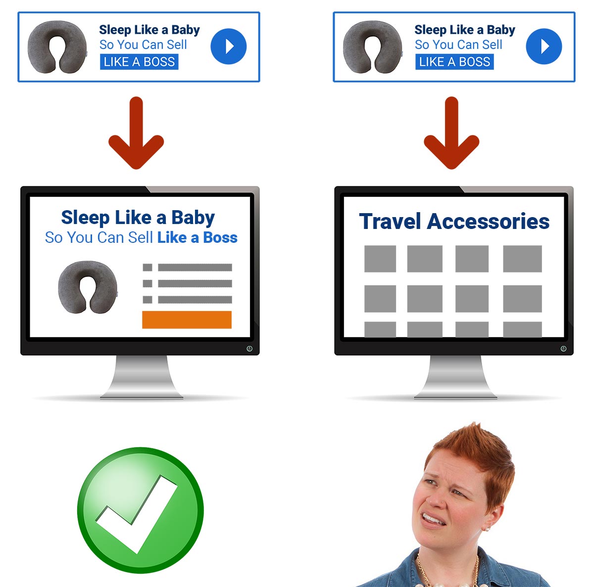
Your Summary of Benefits
The next must-have element of your landing page is a summary of benefits. Your summary of benefits should reinforce the unique value presented in your headline. We must always remember benefits are much different than features. Features explain what. Benefits explain why. Considering our neck pillow, a list of features might be:- Filled With All Natural Goosedown
- Available in 57 Colors
- Moisture-Wicking Fleece
- Say goodbye to neck pain
- Sleep like a baby
- Feel sharp and energized
- Land the big account
- Get rich
Social Proof
Your visitor doesn’t know you, so they come to your site with a healthy level of distrust. A good way to combat this is to include testimonials. We all know that testimonials can be faked, so it is very important to try to legitimize them. Although we generally want to avoid links on landing pages, doing things like putting a small “read full review on Google” link beneath a testimonial makes it feel a lot more real. People probably won’t click the link anyway, but just seeing it there adds trust. You should also avoid reviews that are over the top. It’s okay to subtly imply in your marketing that the neck pillow will help you land the big account, but people take that with a grain of salt. A testimonial that is supposed to be real should not claim “After one plane ride with my new neck pillow, I was named CEO.”Urgency and Fear of Missing Out
FOMO (fear of missing out) should be added to your landing page with the same level of caution as your social proof. Your visitors were not born yesterday. They may not be seasoned marketers like you, but they’ve heard of this tactic before. If you are over the top with your urgency, it is a red flag. It either makes you look desperate, or worse yet, dishonest. Adding “BUY NOW BEFORE IT’S TOO LATE!!!” to your landing page is a bad idea. If you want to be savvy with your FOMO, it should be hard to detect, but work subconsciously. Simple statements that imply limited availability or time limits do the trick:- Solar tax credits may still be available
- Discount Pricing Ends Friday
- Seating is first come first serve. Reserve your spot today
Reducing Friction with Your Call to Action
Our number one obstacle in lead generation is our visitors’ fear of commitment. They don’t know us, they don’t trust us, and they don’t want to sign their life away. Most visitors would prefer to browse anonymously and make their final choice on their own time, all on their own. This unacceptable to us! We’d like to have a little more influence over their decision. We do this by crafting our call to action so that it implies the smallest possible level of commitment possible. Let’s say we are a solar panel installation company. It is a pretty big decision to install solar panels on your house. Do you think this is the type of decision that can be made in a couple minutes based on quick webpage visit? If our call to action is “Install Solar Panels Today,” that requires a huge leap of faith from our visitor. Our visitors obviously have a lot of questions. If they had already done ALL their research, and were ready to install solar panels today, they probably wouldn’t be Googling “Solar Panels.” They must have had at least one conversation with a professional at this point, and that person is probably going to win the job. The goal of our landing page is to get them on the phone, not sell them solar panels. Going directly for the sale is like throwing a 60 yard Hail Mary on every play. Getting a first down is more important. A more appropriate call to action would be to “See if you Qualify for Tax Credits” or “Find Out if Your Roof is Viable for Solar Panels.” These call-to-actions simply instruct your visitor to ask a question. It’s a completely harmless proposition. Nobody is buying or committing to anything. It’s the type of thing you could do without your spouse’s permission. You wouldn’t even get in trouble!
The Lead Capture Transaction
Now that we have identified some key elements of a landing page, let’s switch gears and explore the transactional nature of capturing a lead. When someone lands on your page, they are presented with an offer of some sort. Your page tries to illustrate why the offer is worth their while, and your visitor considers whether or not they should proceed. At this point, this is like any other kind of transaction. A transaction simply means: I give you this, you give me that.What Can Make or Break the Transaction?
It’s very simple. Does the value of the offer outweigh the value of that which must be given up? For example, let’s say you are thirsty, and you like Coke. Will you give me $1 for a 16oz Coke? Of course. You want the Coke more than you want your $1. Will you give me $2? Mmm… probably, depends the thirst level and how far away the next vendor is. Will you give me $5? Never! This all probably seems painfully obvious, but there is a second side to this that is not so obvious. One of the most common things you will see on a landing page is a contact form with a vague call to action like “Learn More” or “Contact Us Today.” What’s missing here? Look at the first offer. What do they get? A 16oz Coke. That is extremely specific. A 16oz Coke is concrete, and it is very easy to determine its value. Since we know the value of the offer, we can quickly and easily decide if it is worth it. On the other hand, what is the value of “Learning More” or “Contacting Us”? Who knows, it’s too abstract. If we can’t determine the precise worth of the offer, how are we supposed to know if the proposed transaction is worth it? What we need to do is turn the abstract offer into something more tangible. Below is a great example of this.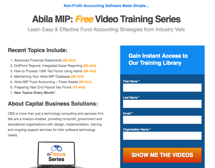
Capture More Leads
Following these guidelines, you can capture leads hand over fist if you can identify and address your visitors’ true emotional needs.If you are looking to increase your conversion rate, capture more leads, and improve your bottom line, call the web design and internet marketing pros at 919-341-8901 or contact us online today.
Tags: Digital Marketing • Search Engine Optimization • Web Design
